Work in progress Work in progress
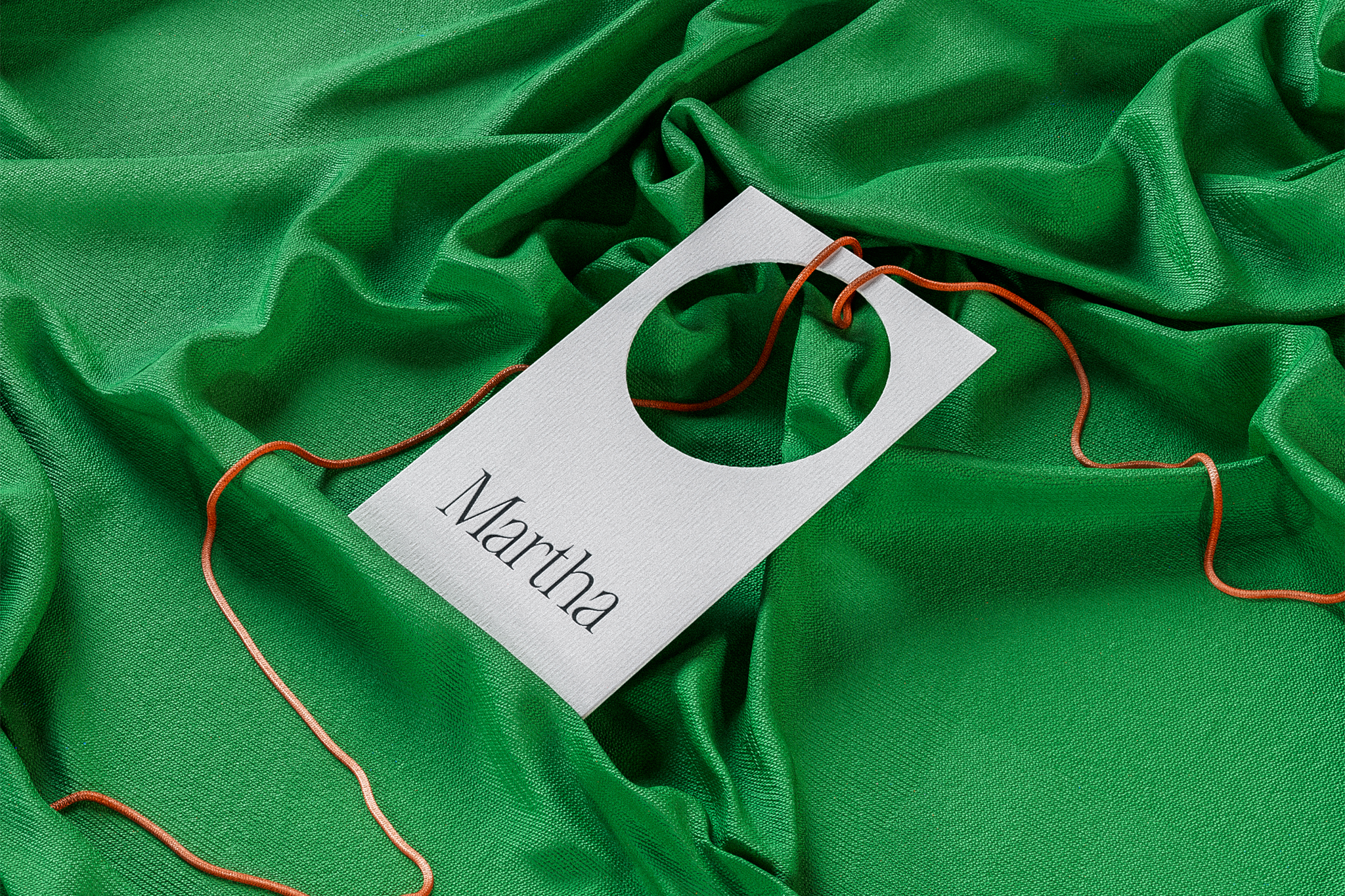
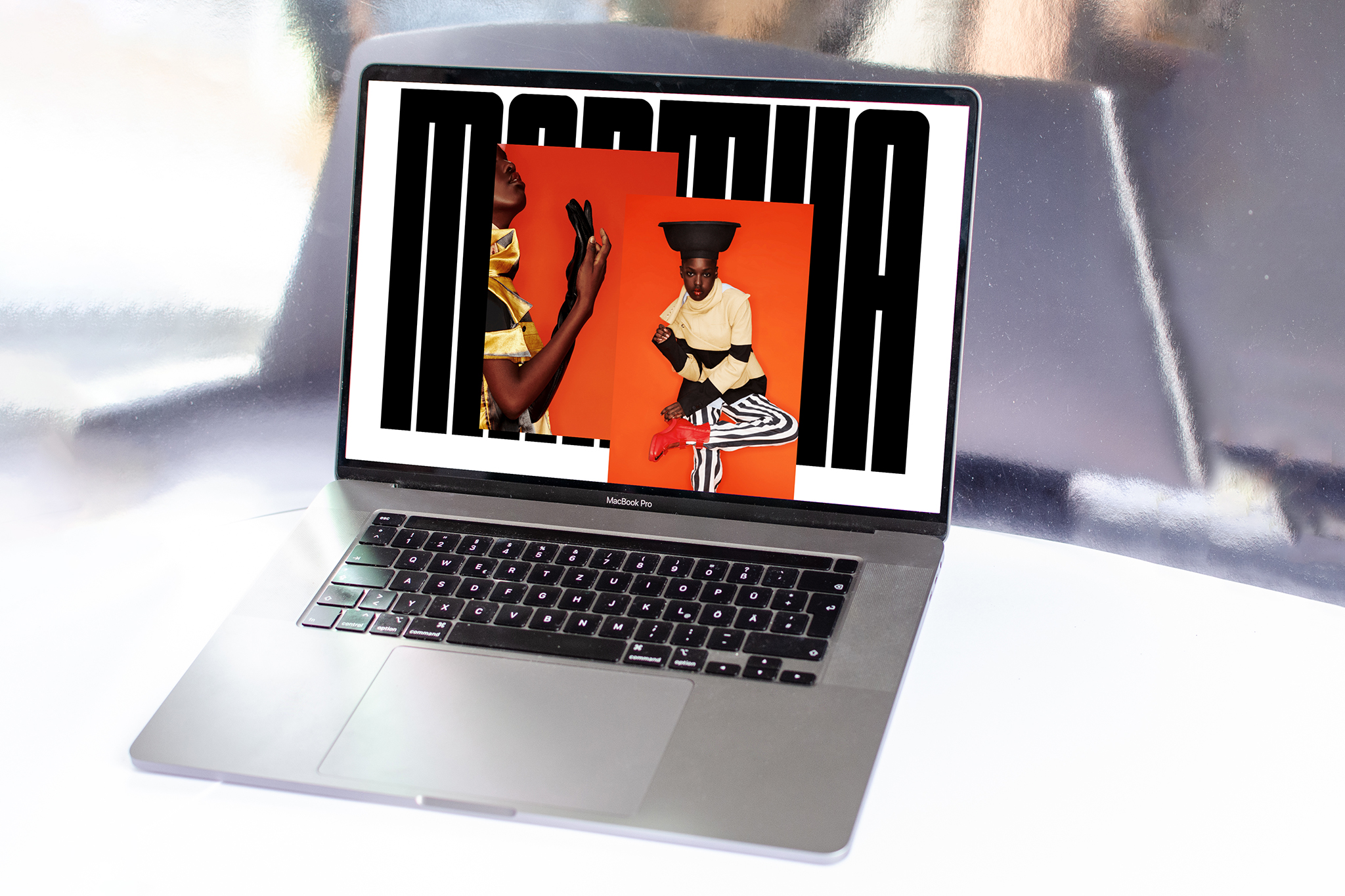
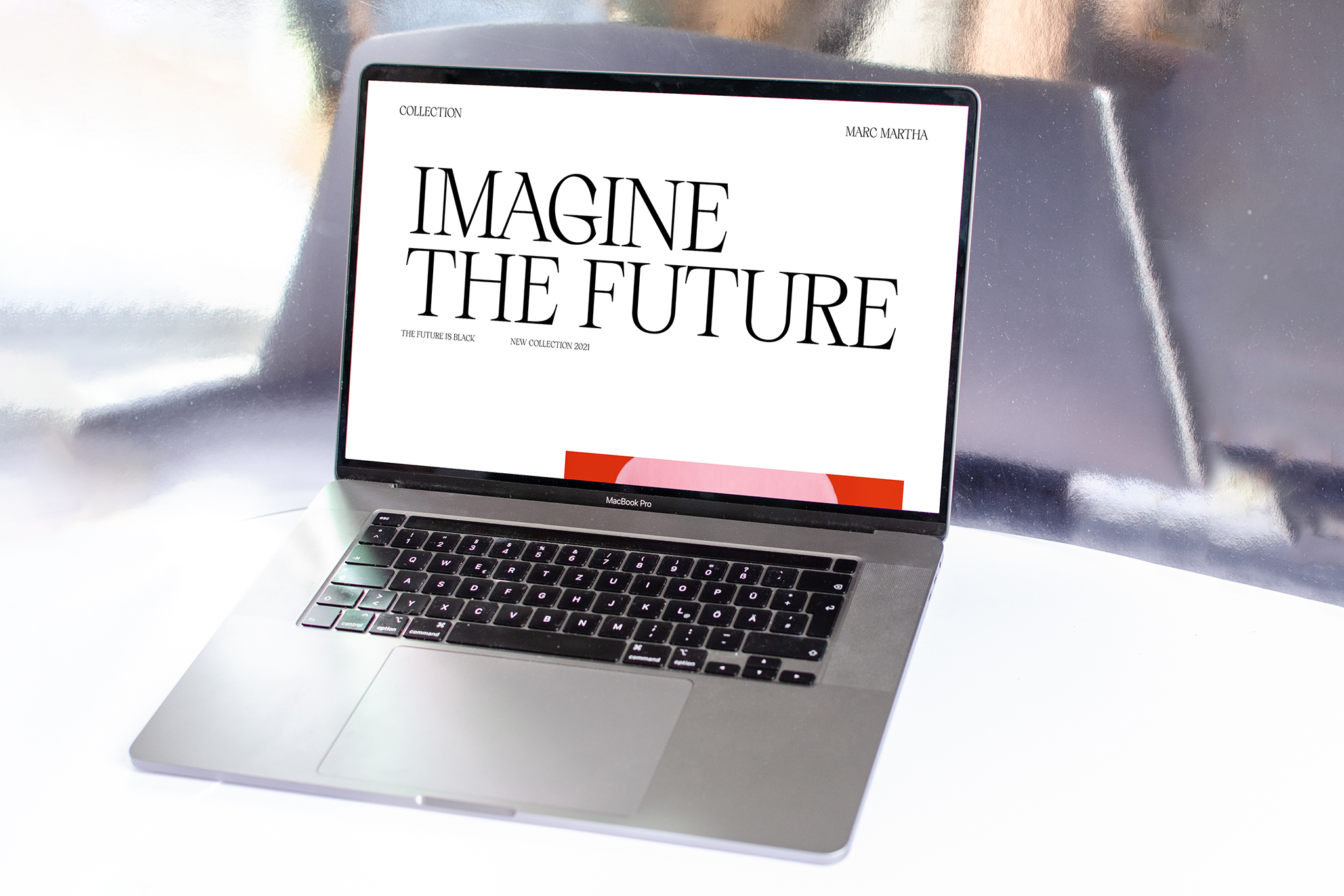
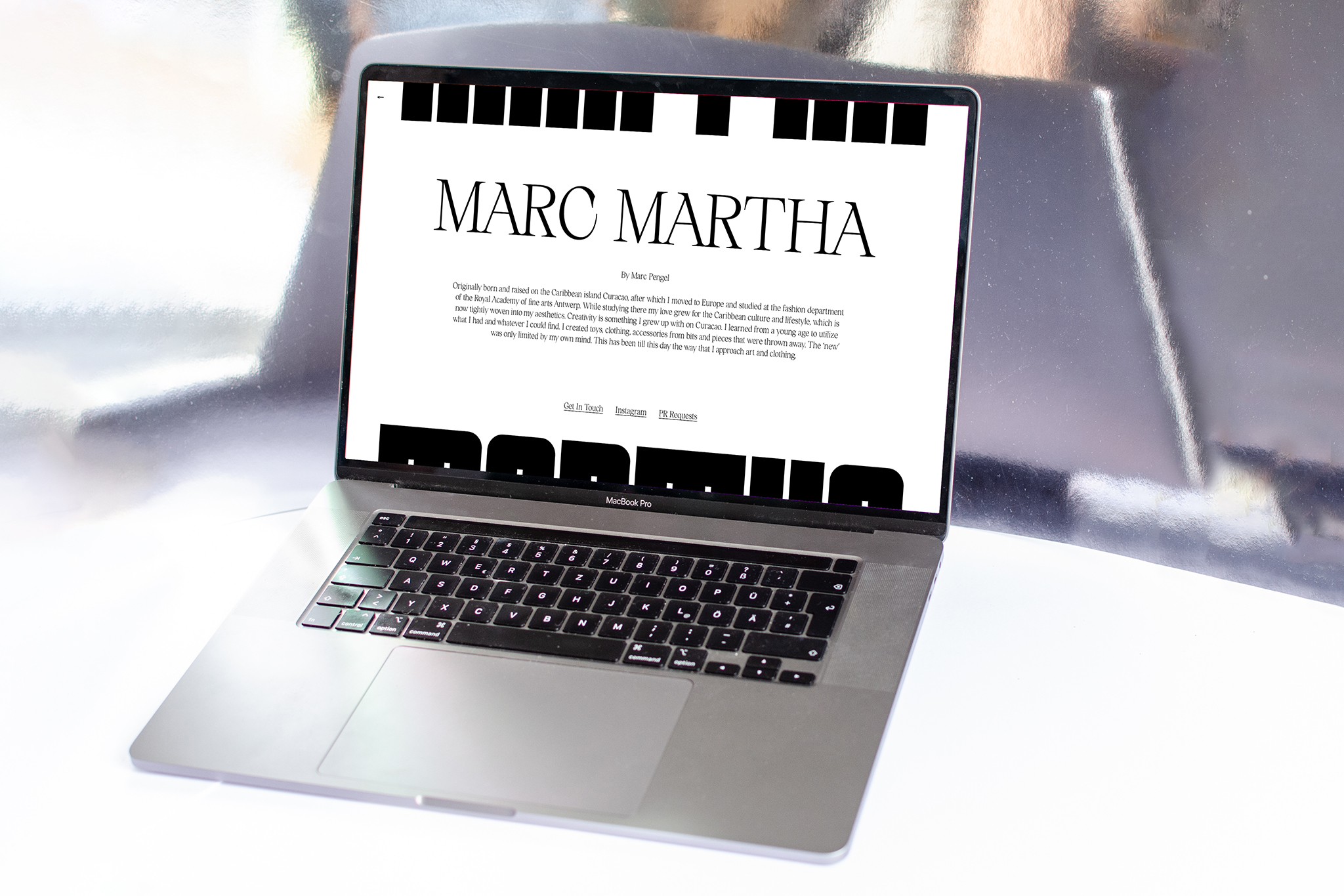
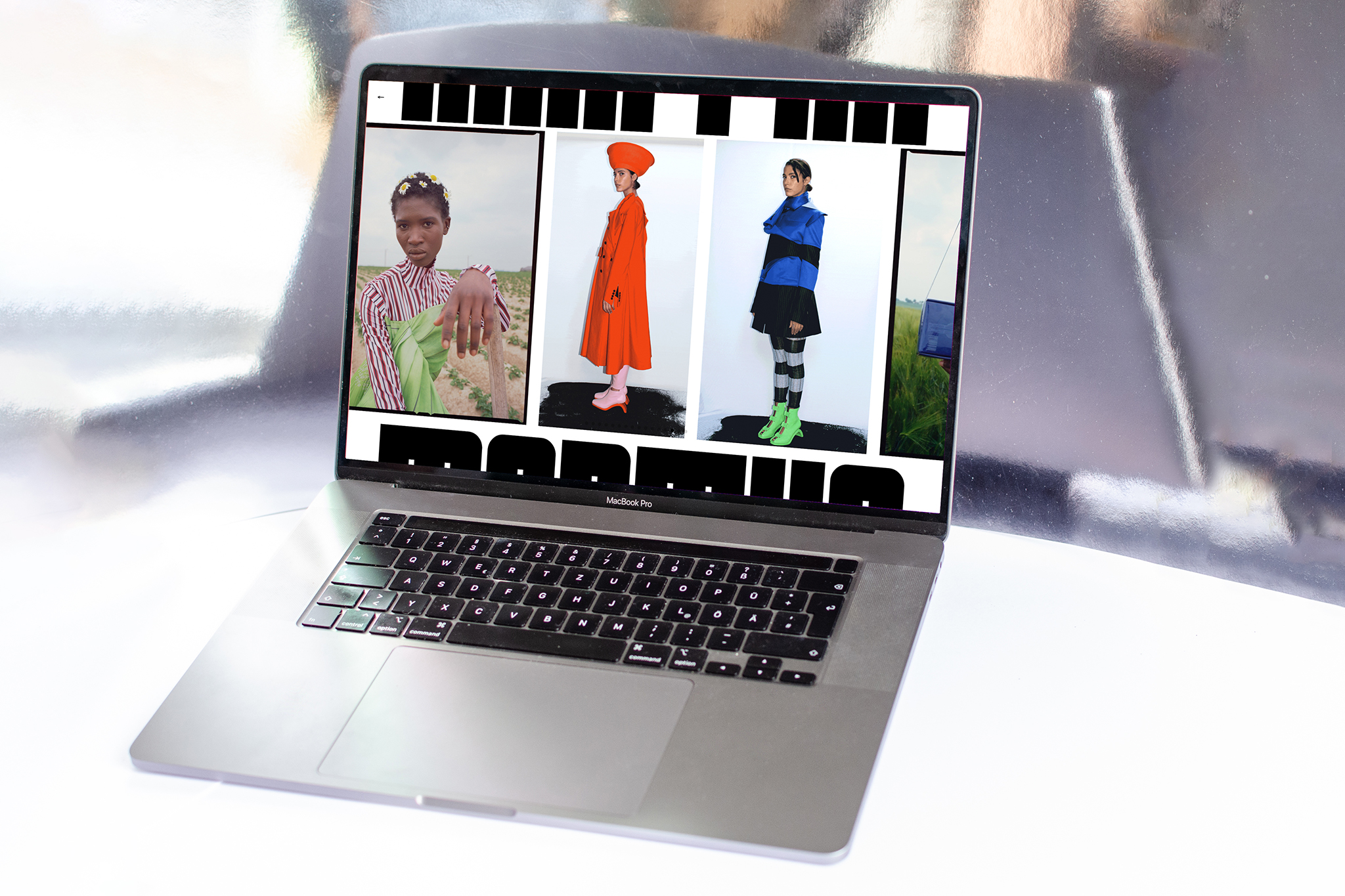
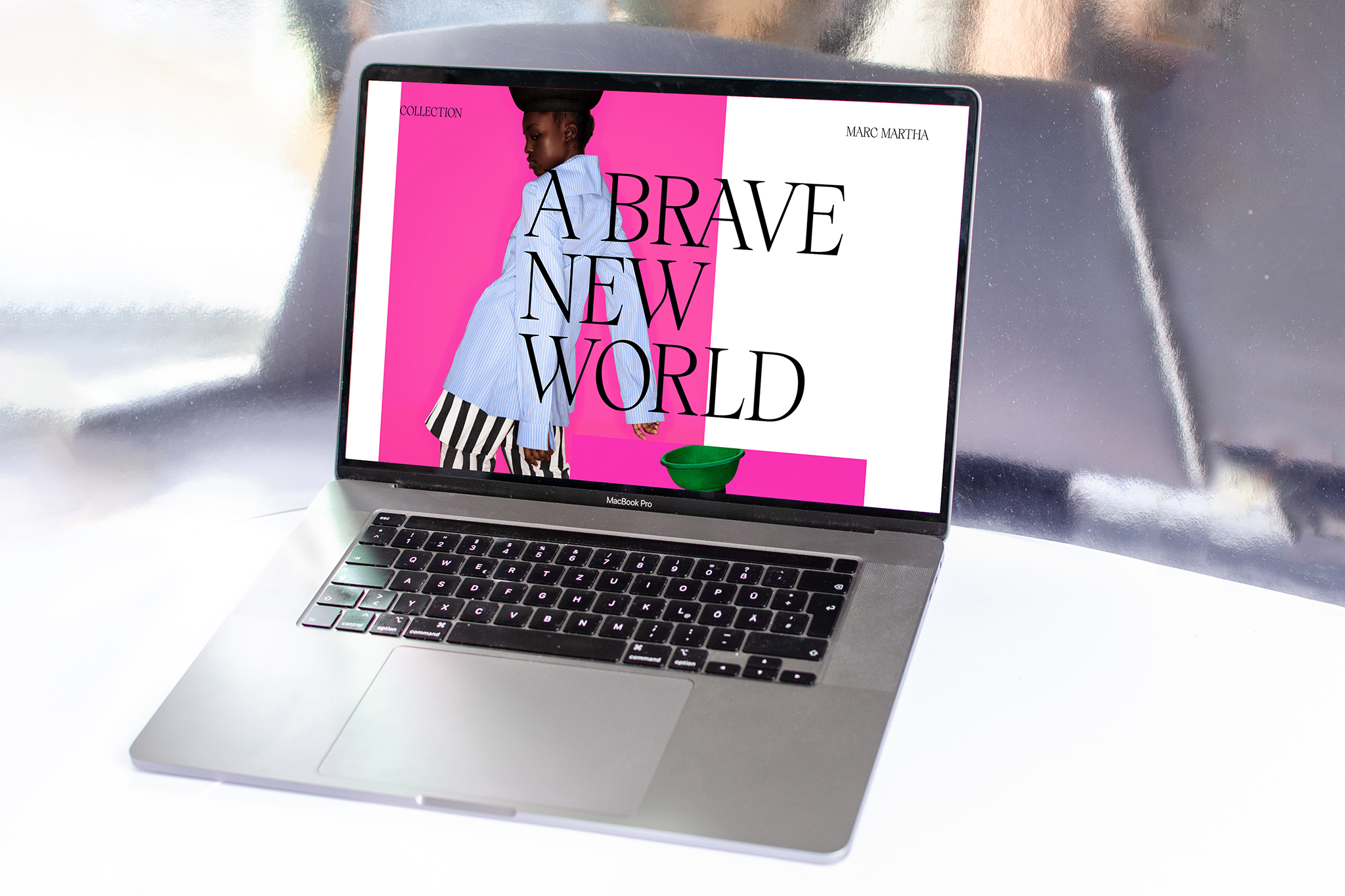
MARTHA
Branding & Webdesign
for fashion designer Marc Martha
May 2021
Branding & Webdesign
for fashion designer Marc Martha
May 2021
© Studio Böreck
Originally born and raised on the Caribbean island Curacao, Marc Martha has learned from a young age to utilize what he has and whatever he was able to find. This has been till this day the way that he treats art and clothing. His love for the Caribbean culture and lifestyle are tightly woven into his aesthetics. This approach and the concept behind his collection are especially reflected in the choice of typefaces for the brand identity.
Visit his website here


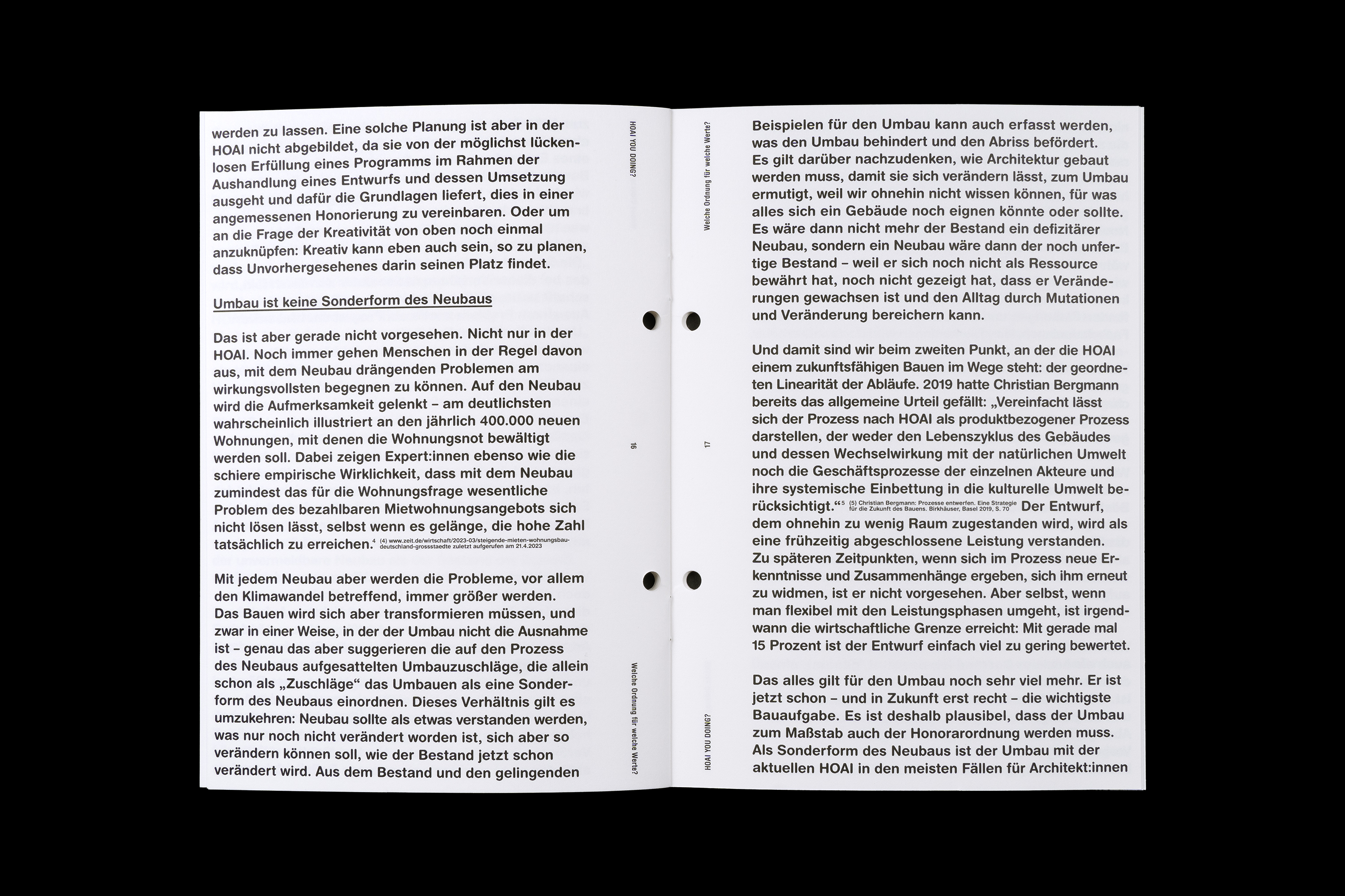

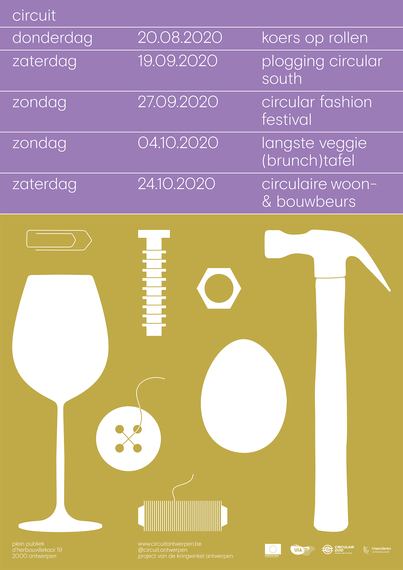
HOAI YOU DOING?
Poster and Brochure for a series of events at DAZ Deutsches Architektur Zentrum
June 2023
© Fons Hickmann M23
with Bjoern WolfThe Honorarium regulations for architects and engineers (HOAI) serve as a guideline for many architects and clients as to what services are to be expected and remunerated. It is based on a social understanding of what planning and building is. In view of the current challenges, however, the question arises if the instrument of HOAI needs to be rethought and reoriented. The DAZ organised a series of talks, which were accompanied by a brochure with an essay by Christian Holl.
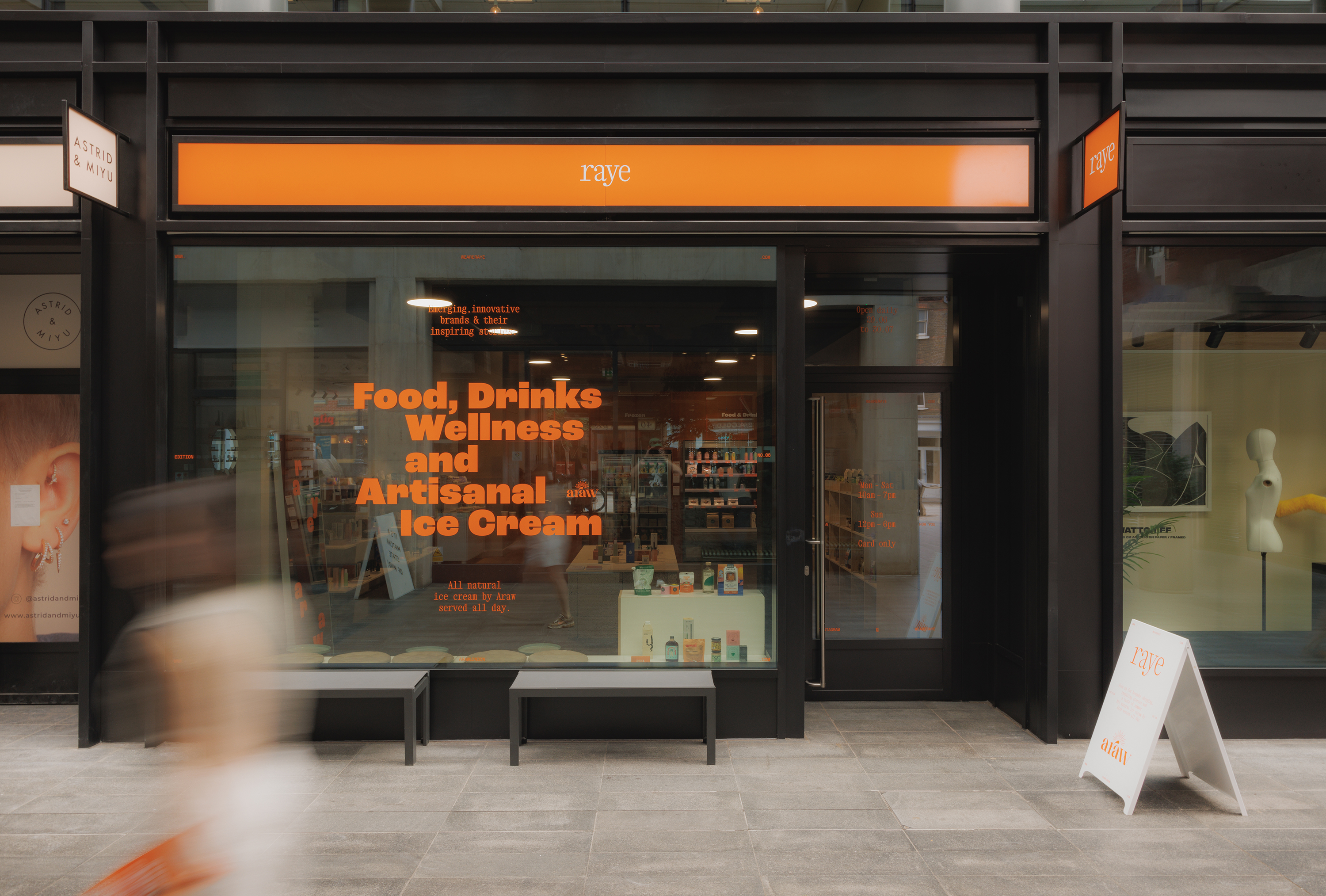


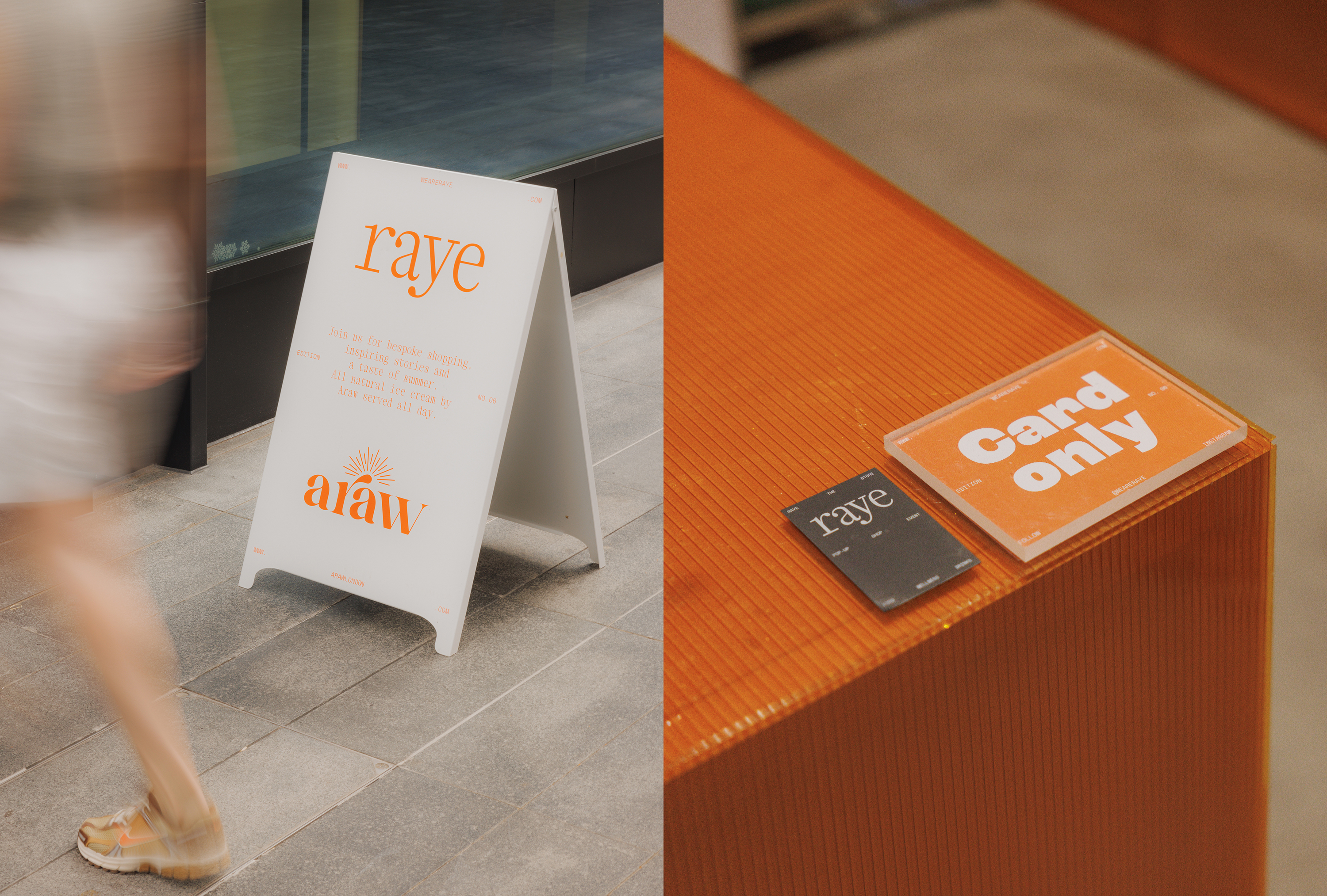
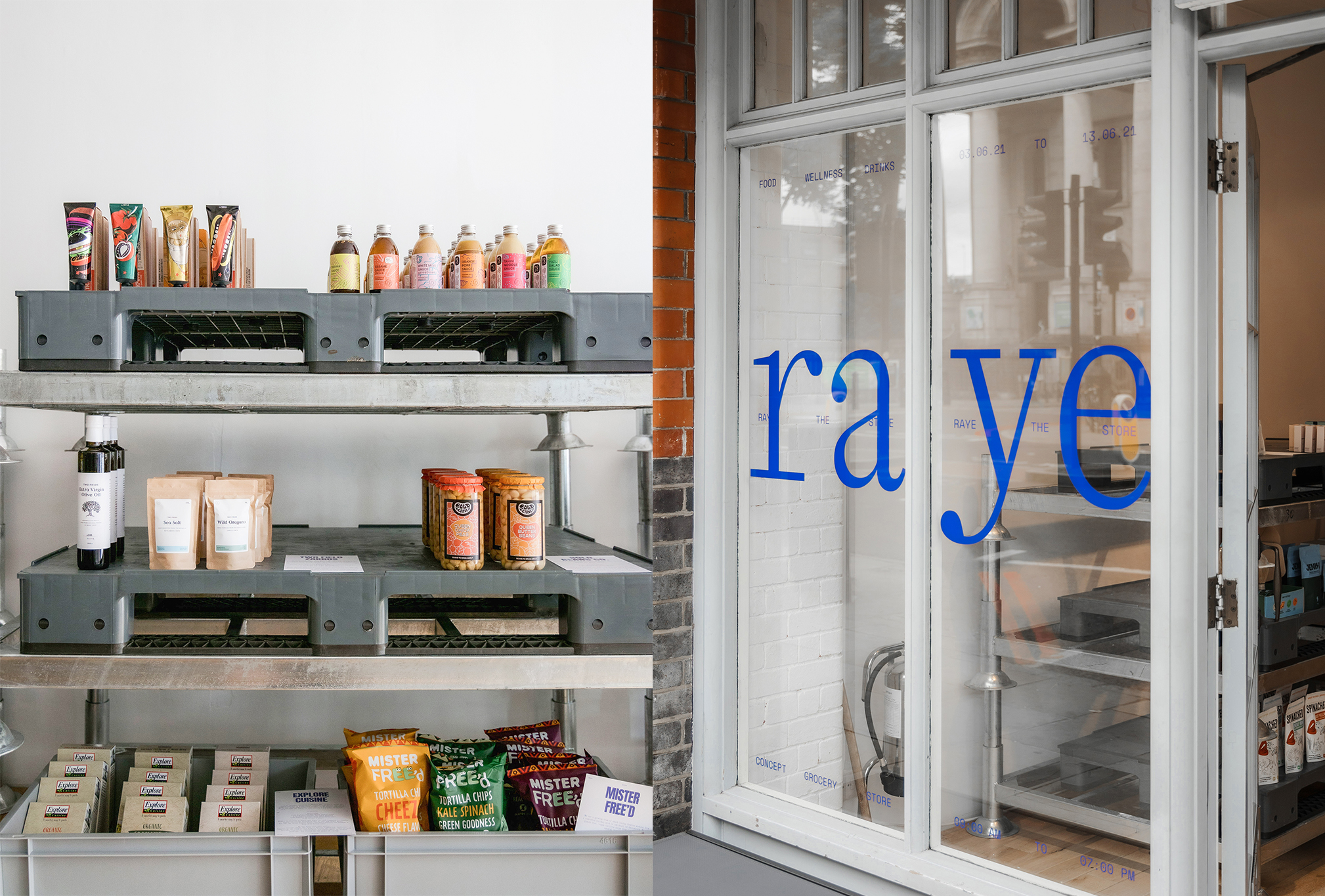
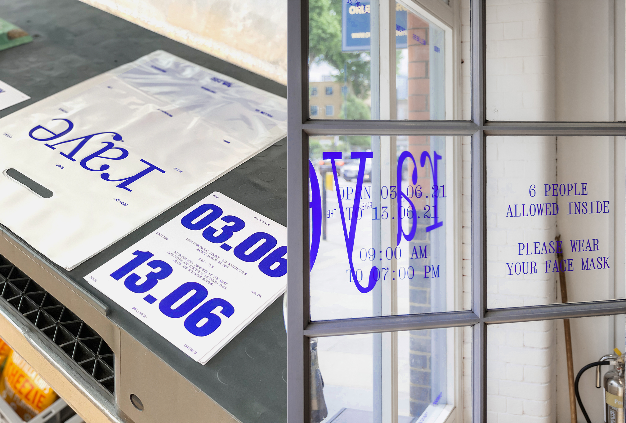
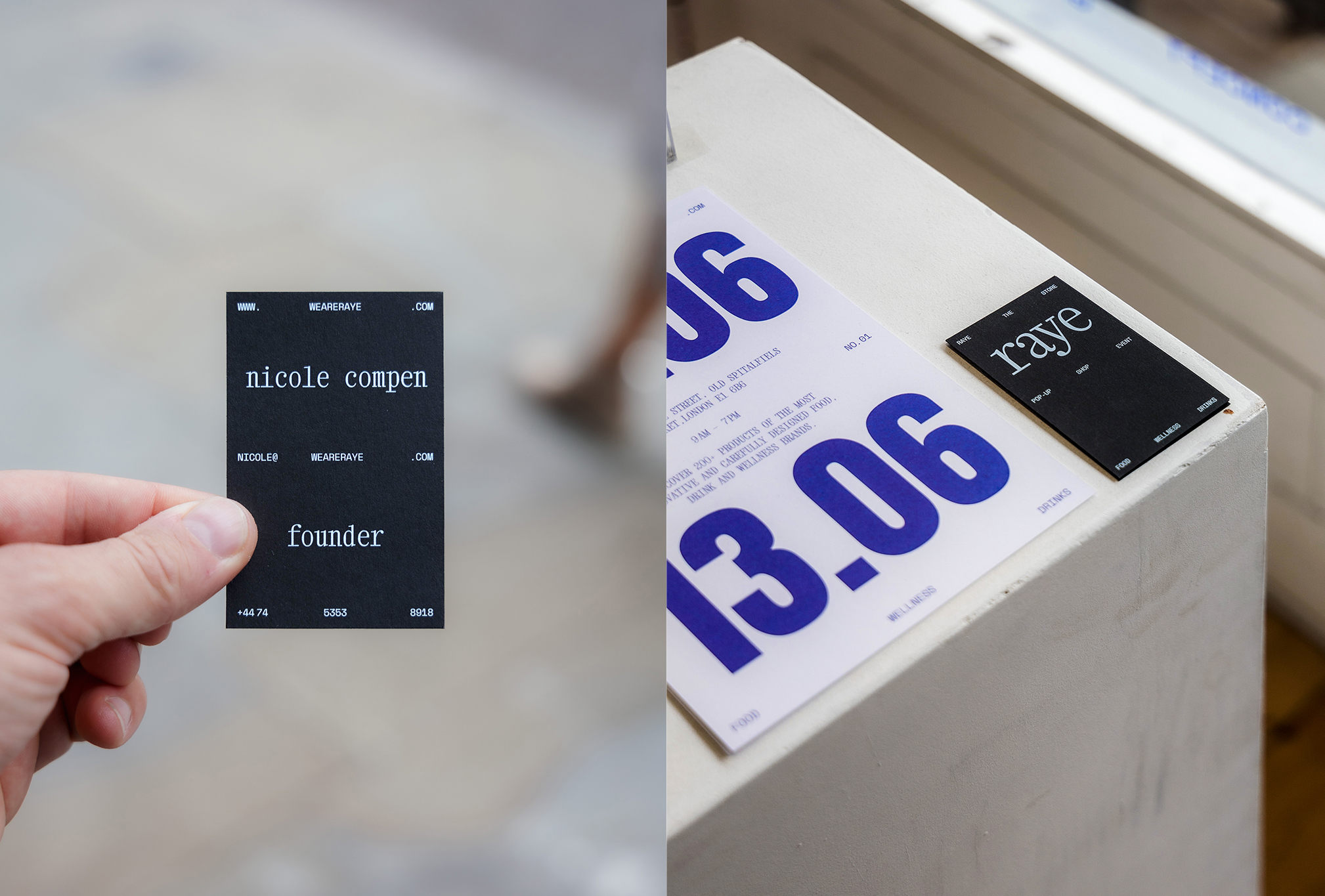
RAYE – THE STORE
Edition 6
Corporate Design for a grocery pop-up store
June 2023
© Studio Böreck
Raye — The Store is showcasing hundreds of products of the most innovative and exciting food, drinks and wellness brands Spitalfields Markets. It brings together a meticulously curated cohort of selective brands in one store with innovation, nutrition, and design at its core.
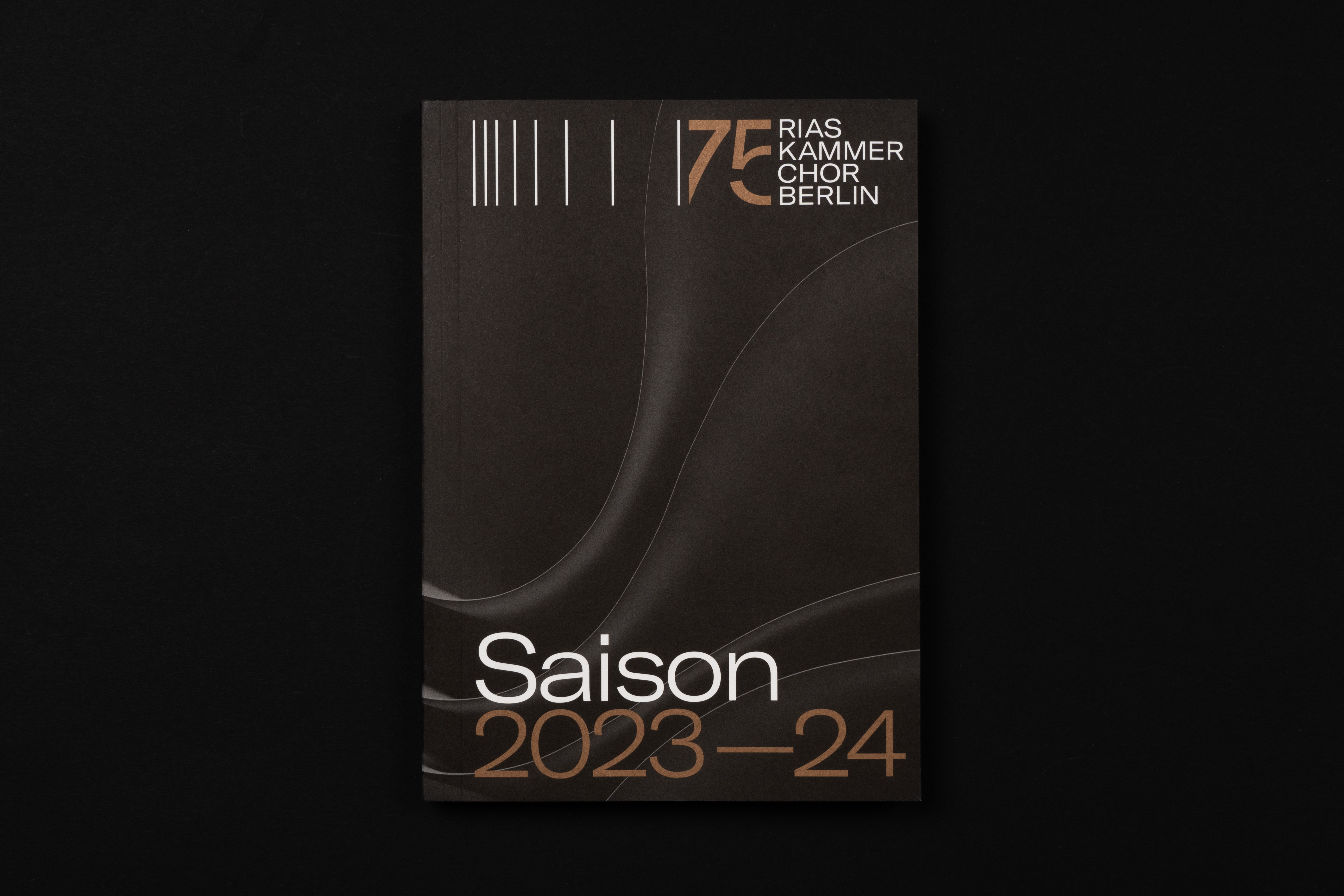
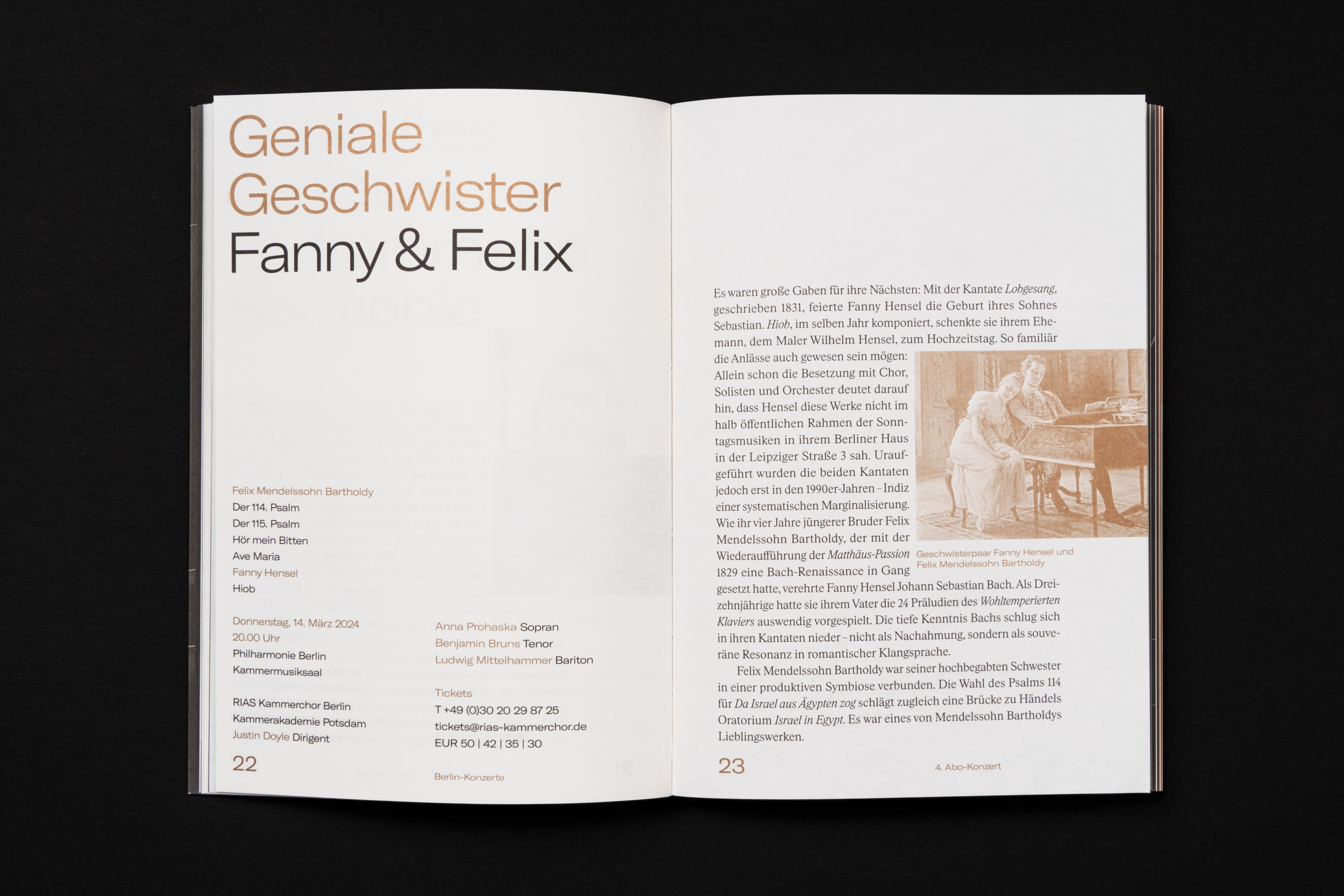
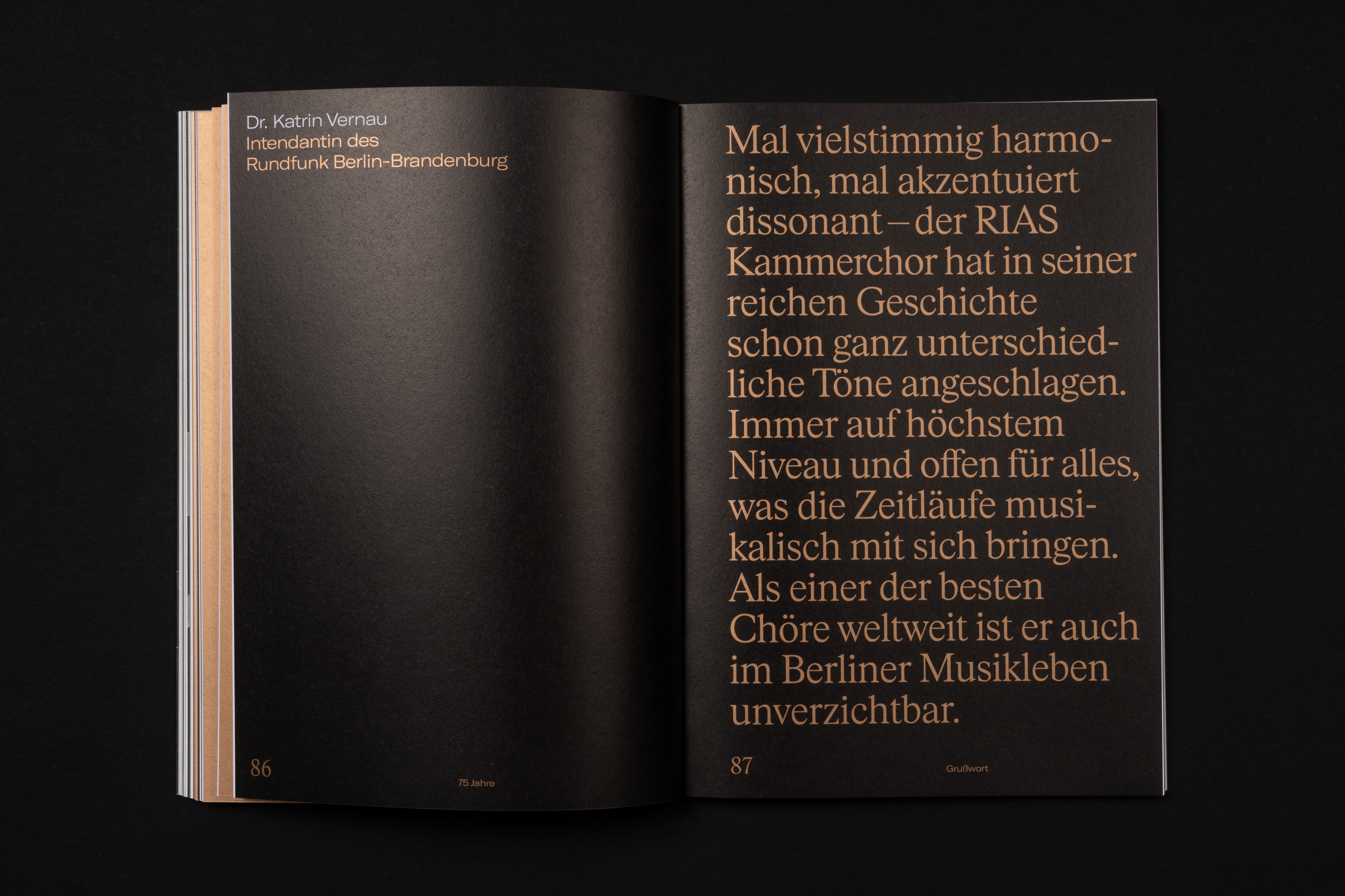


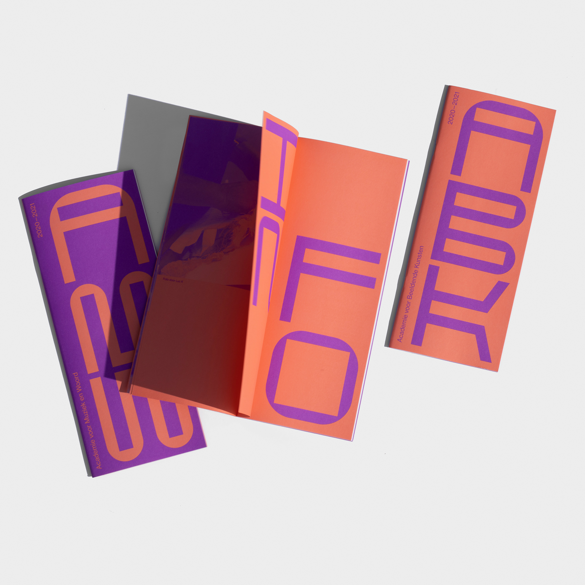
RIAS Kammerchor
Programme Book
Programme book for the anniversary season of RIAS Kammerchor
May 2023
© Fons Hickmann M23
with Raúl KokottThis season the RIAS Kammerchor celebrates its 75th anniversary. The season book has been redesigned accordingly. It comes with a few special printing and production features, such as the use of a metallic spot colour, a change of paper within the book and a gatefold cover. The 3D renderings were created by Paul Theisen.
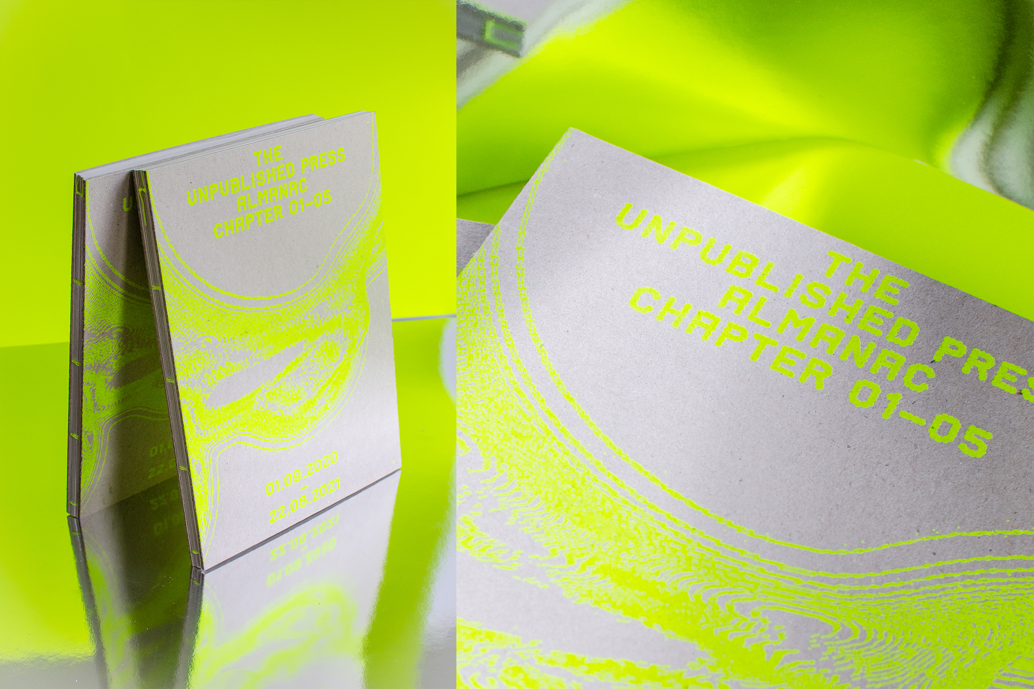


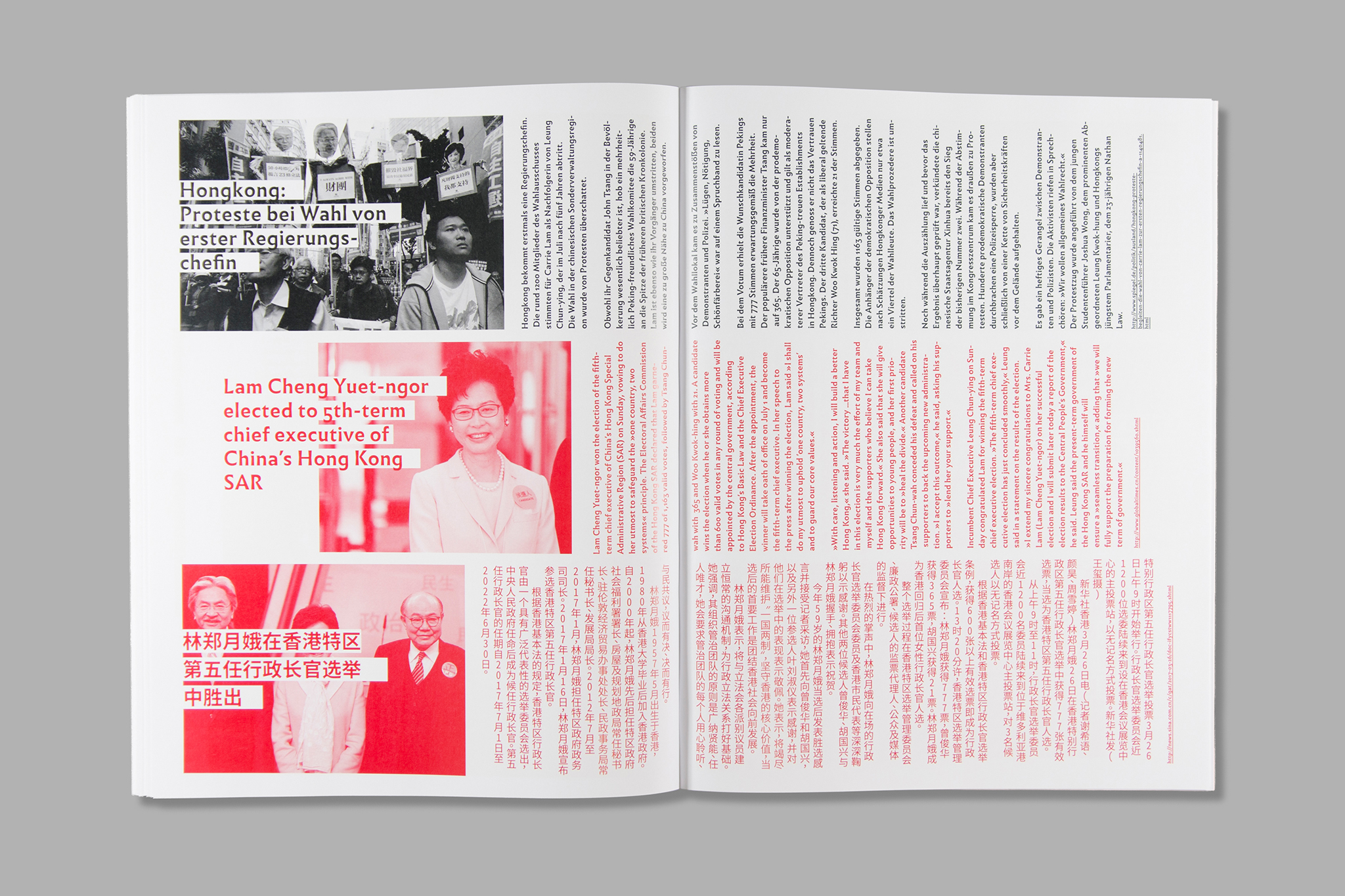
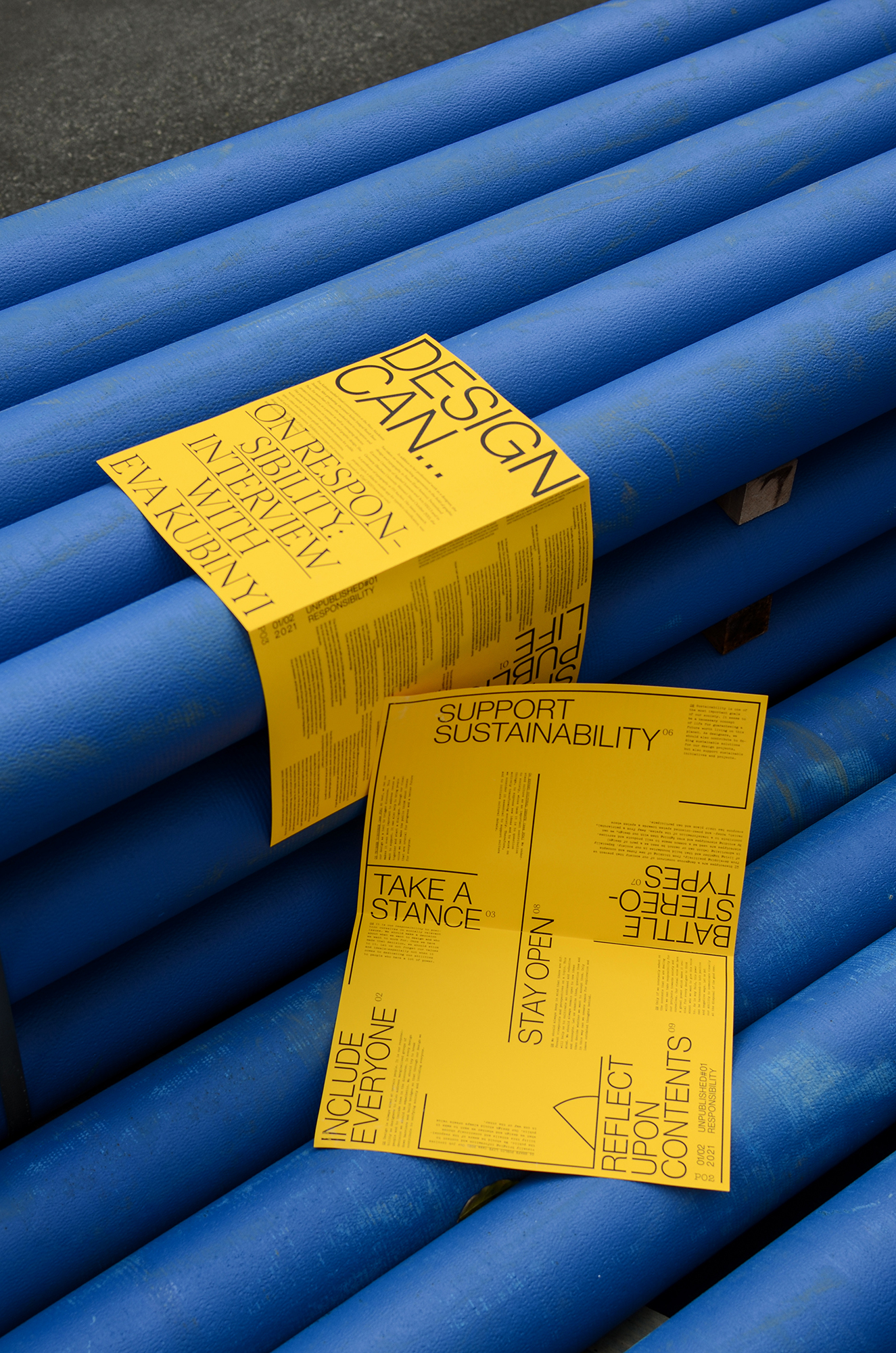
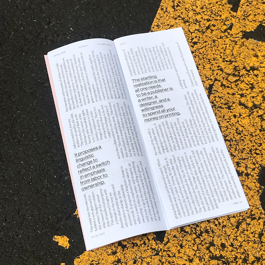
UNPUBLISHED PRESS
How do we grow, filter and share contents?
Master Project, Royal Academy of Fine Arts, Antwerp
October 2020 – June 2021
How do we grow, filter and share contents?
Master Project, Royal Academy of Fine Arts, Antwerp
October 2020 – June 2021
© Studio Böreck
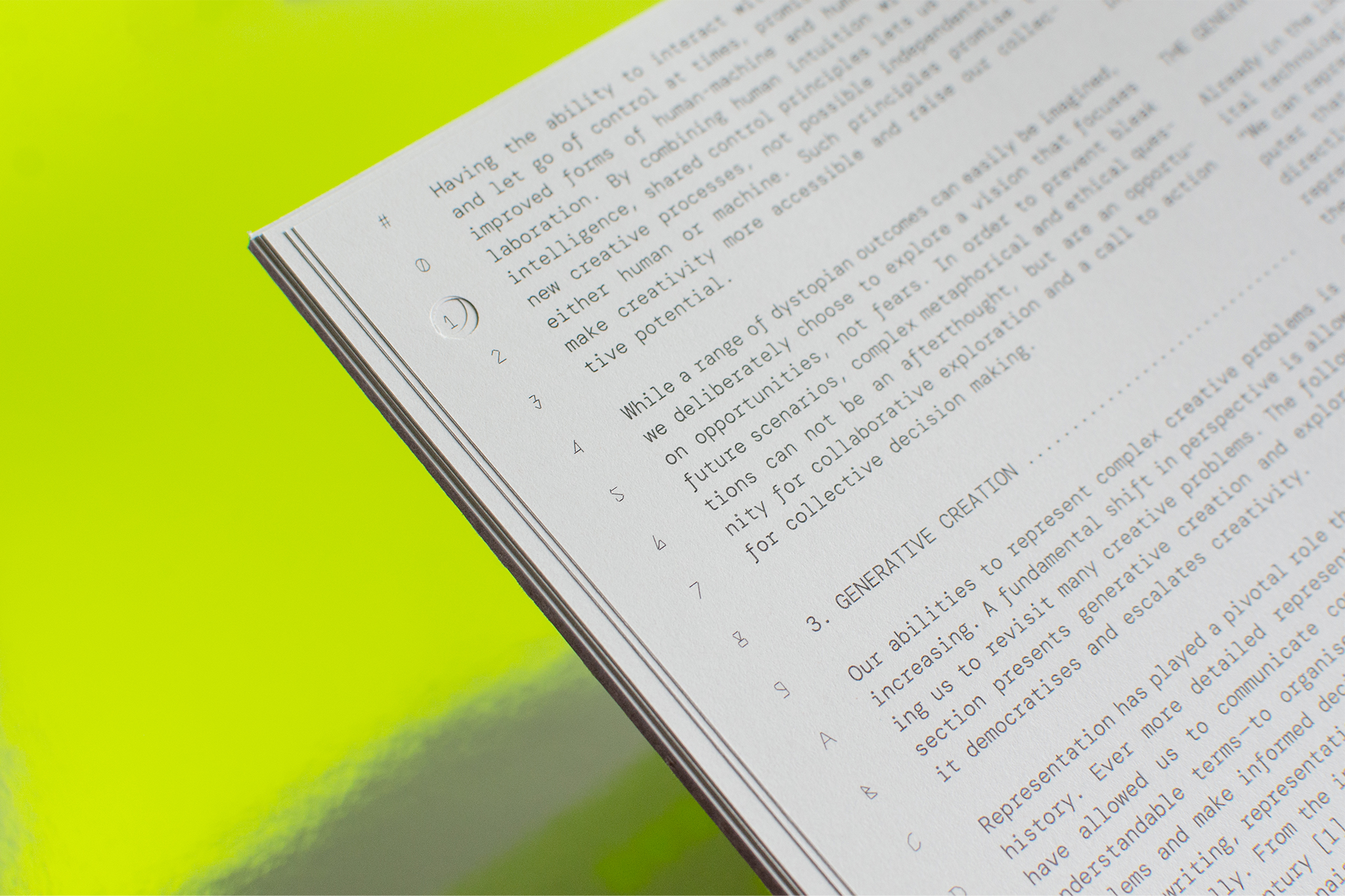
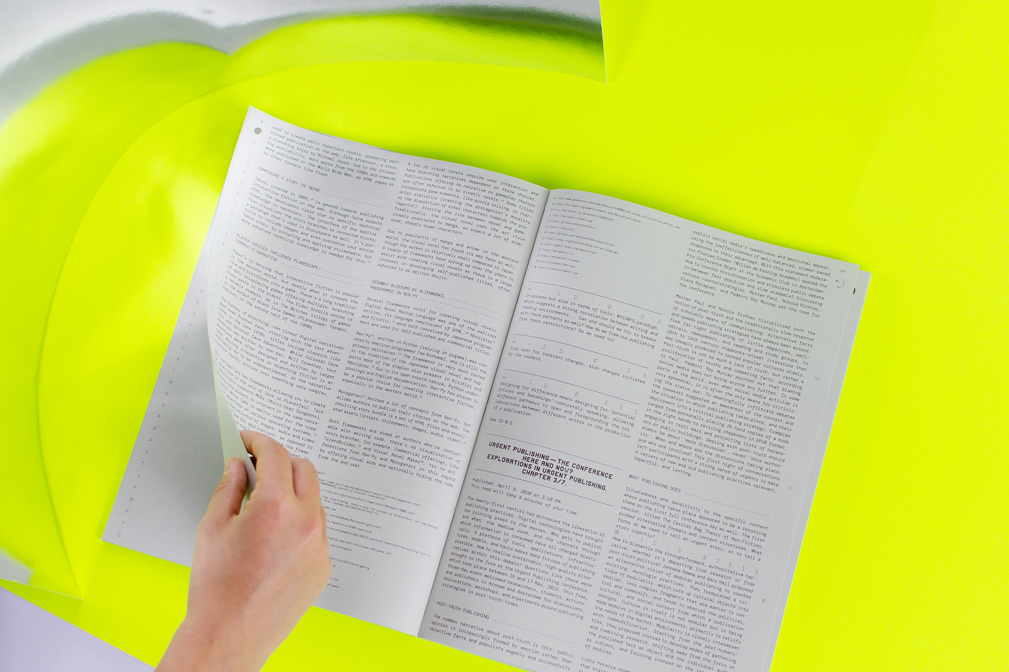
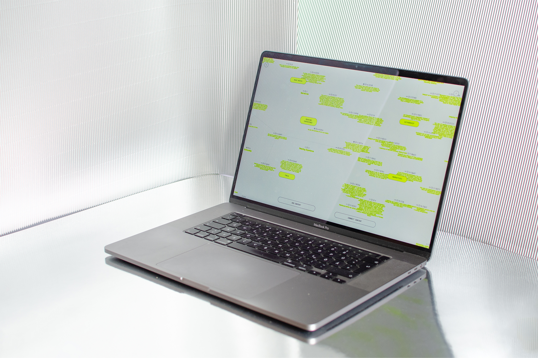
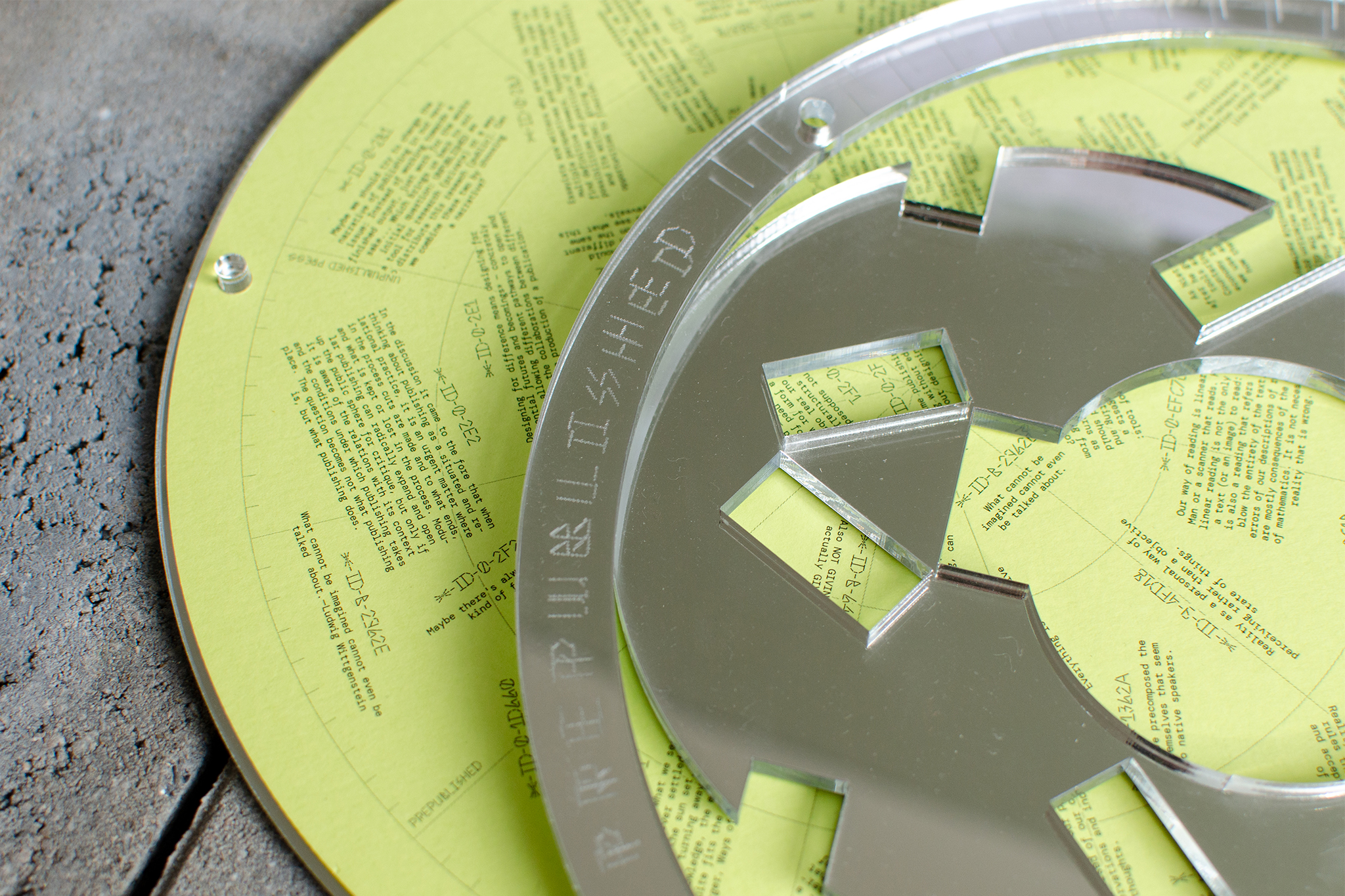
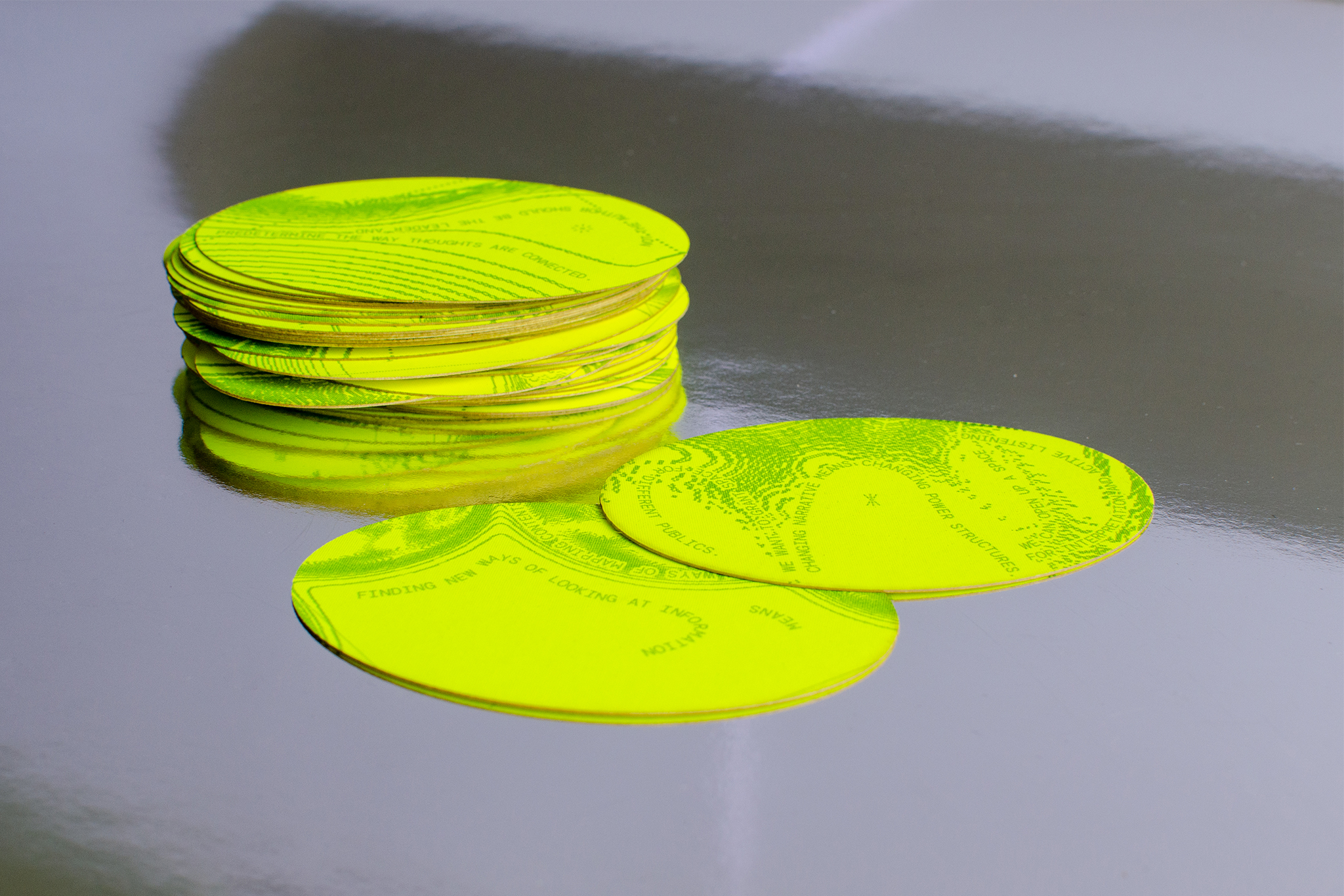
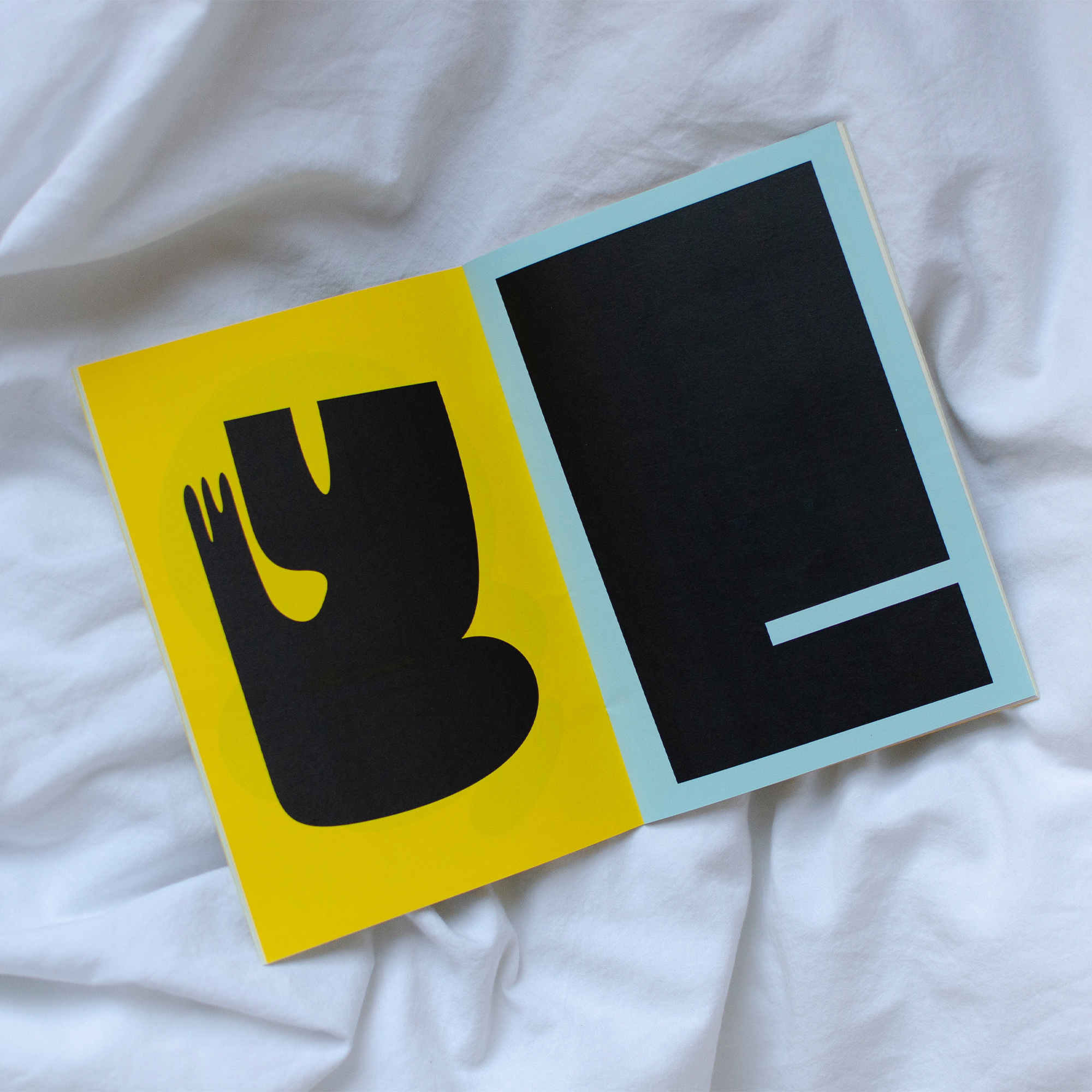
Unpublished Press is a collaborative creative practice that explores topics through research, conversation and publishing. In this publishing house, we do not only act as the designer, we are authors, editors and publishers in one — or in our case two—person(s).
Unpublished Press is challenging traditional forms of publishing by questioning the definition of public in the first place. We want to open up the evolution of contents to the public, give insights into the process information go through and make the process visible. What is usually shared with the public and what remains hidden? In our publishing house, the reader is not only invited to engage with the final product but every stage of the process is accessible to anyone.
Explore one part of the project here
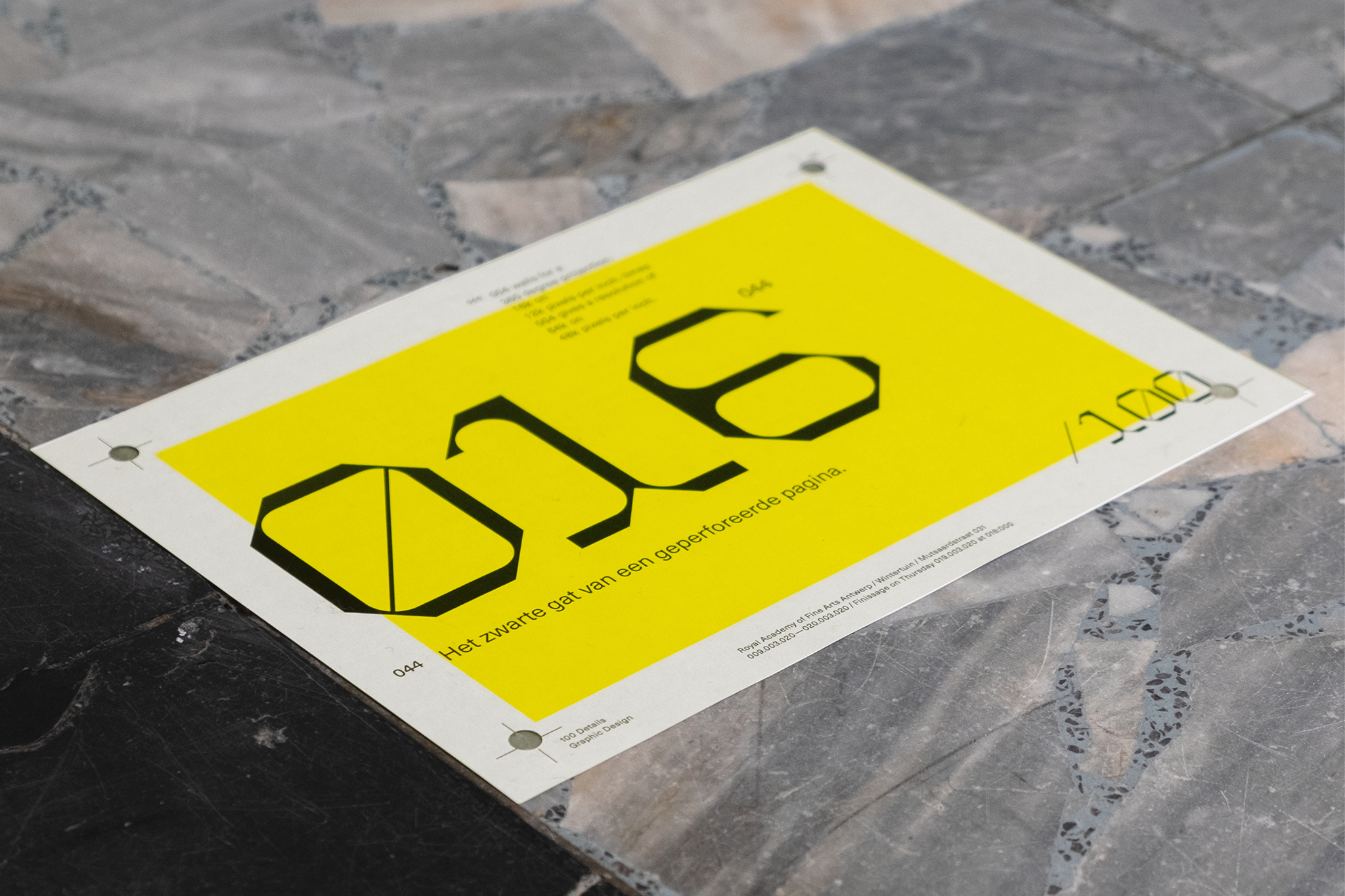
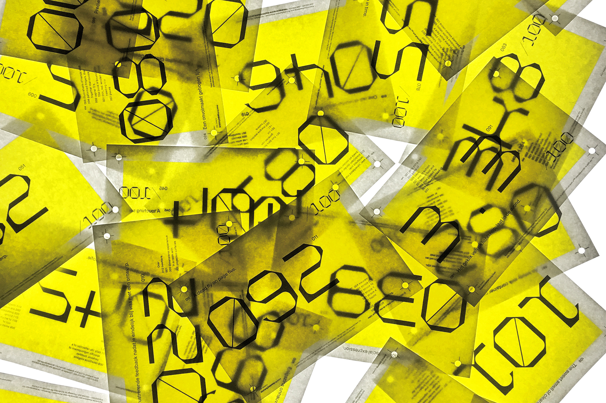
100 DETAILS
Exhibition about the Graphic Design department of the Royal Academy of Fine Arts, Antwerp
March 2020
Exhibition about the Graphic Design department of the Royal Academy of Fine Arts, Antwerp
March 2020
© Studio Böreck
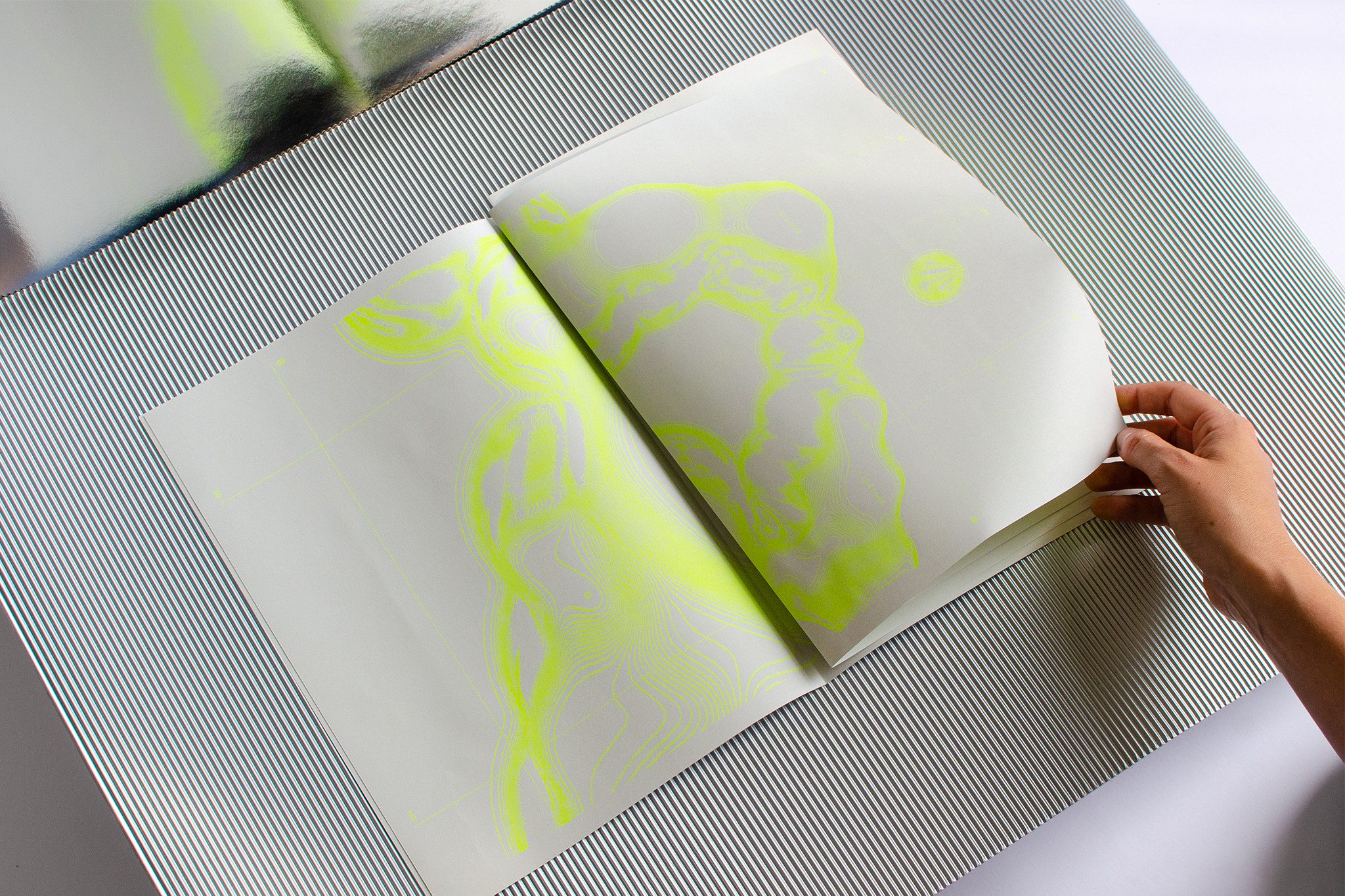
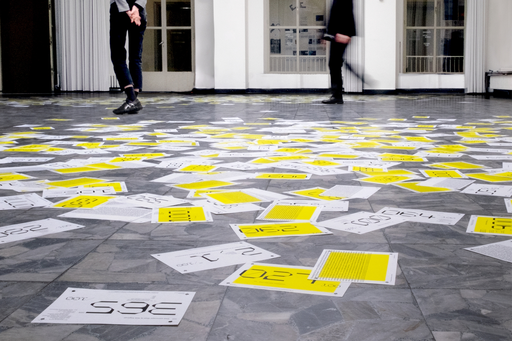
Starting from 001 list of 100 items that represents the recent history of the programme, 023 students multiplied this into 004 lists, 001 audio recording, 008 projectors together creating 001 large projection, 2k4 minutes of film, 010 light boxes and 100 different handouts printed on 1k4 sheets of paper normally worn by runners. However, during its setup, the exhibition was already closed (corona). No exhibition, no public. The handouts are to be bound in 014 catalogues.
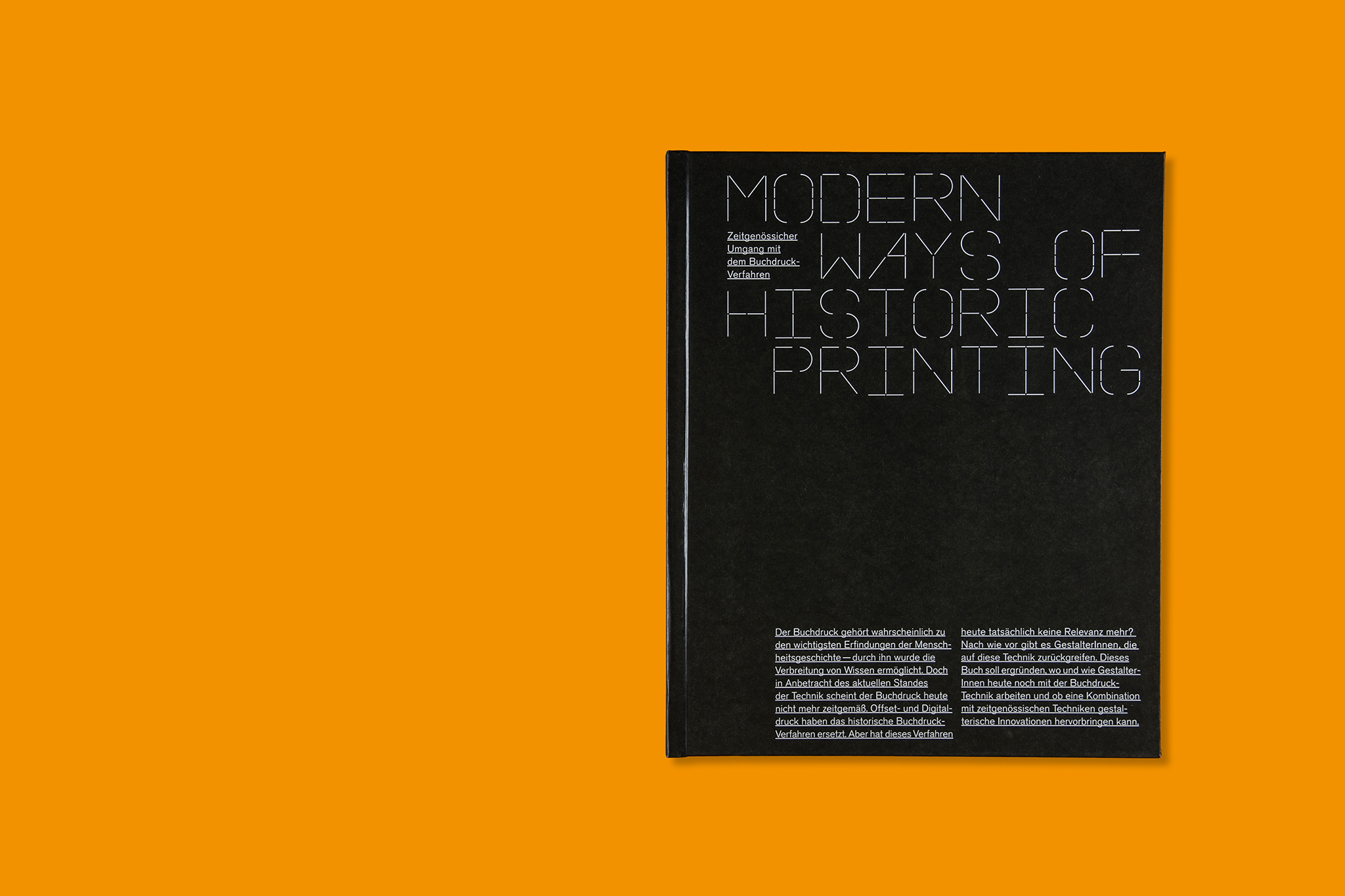
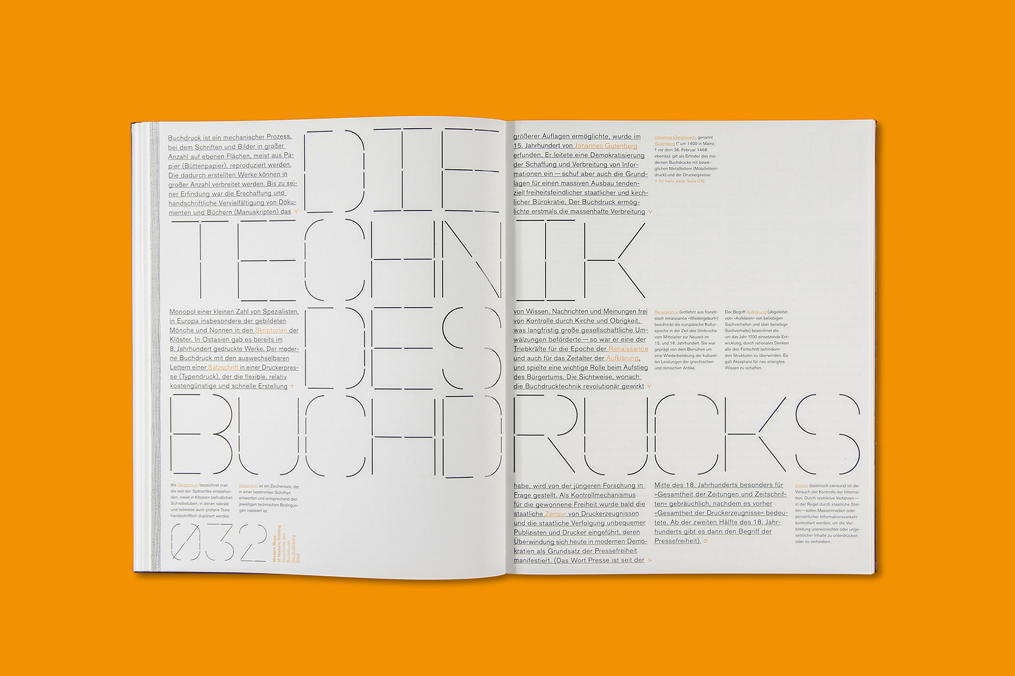


MODERN WAYS OF
HISTORIC PRINTING
Bachelor Project, University of Applied Science Aachen
October 2018 – February 2019
HISTORIC PRINTING
Bachelor Project, University of Applied Science Aachen
October 2018 – February 2019
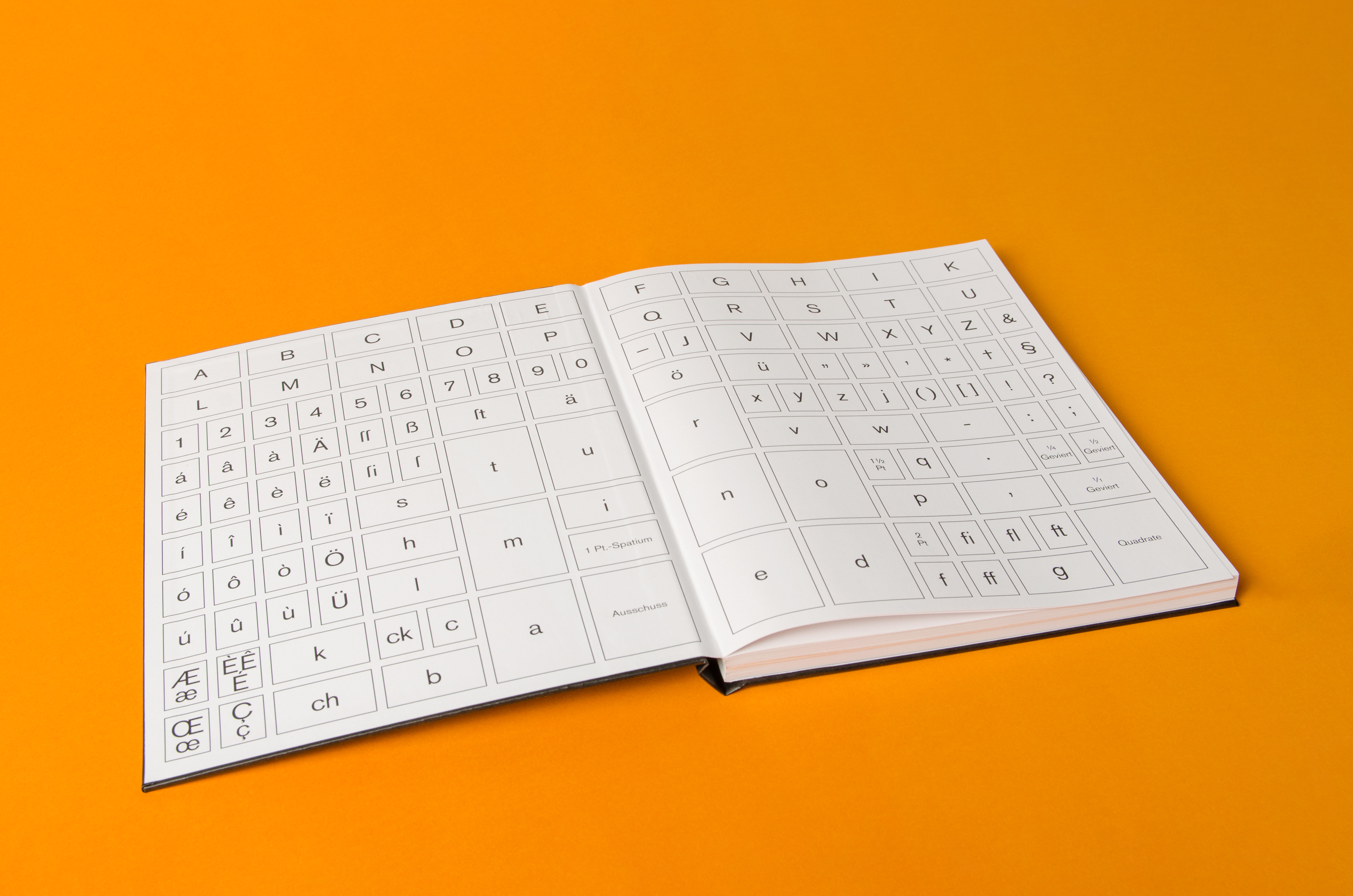
Letterpress printing is probably one of the most important inventions in human history – it has made the dissemination of knowledge possible. However, in view of the current state of technology, letterpress printing no longer seems up to date. Offset and digital printing have replaced the historical book printing process. But is it really no longer relevant today? The project “Modern Ways of Historic Printing” aims to find out if and how designers still work with letterpress technique today and whether a combination with contemporary techniques can produce creative innovations to the design. In order to explore the topic experimentally, a typeface was designed and translated into a modular letter system for letterpress printing, which was used to print a poster installation.
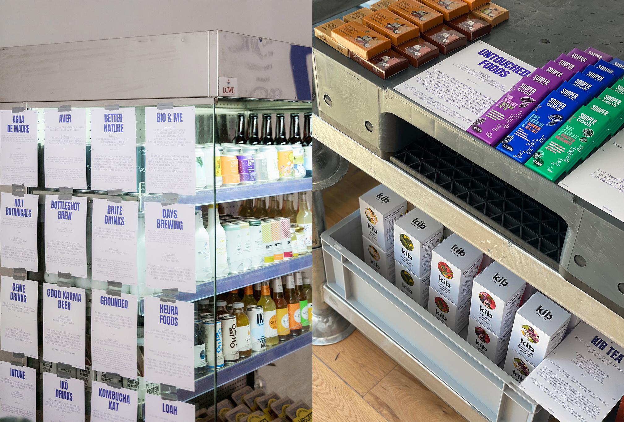
RAYE — THE STORE
Corporate Design for a grocery pop-up store
April 2021
Corporate Design for a grocery pop-up store
April 2021
© Studio Böreck
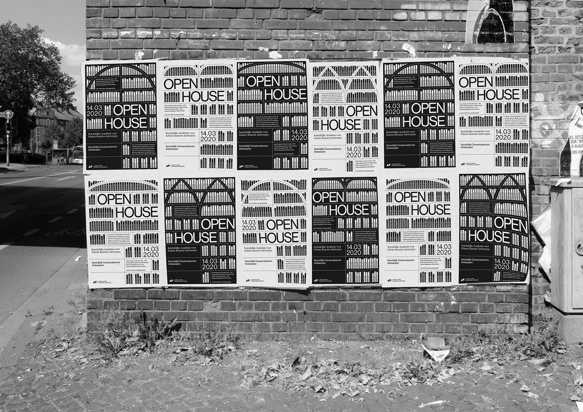

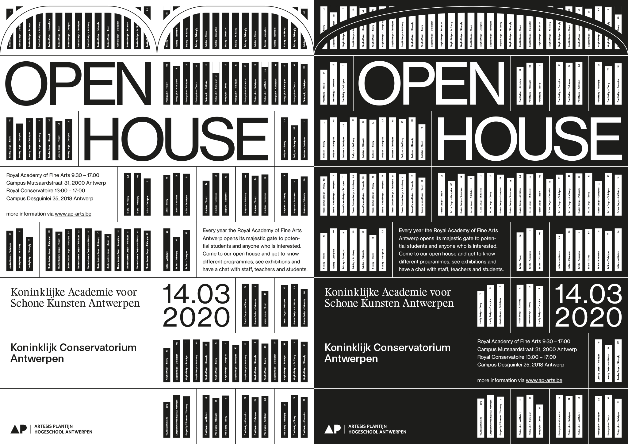


OPEN HOUSE
POSTER
Poster for the Open House event at the Royal Academy of Fine Arts, Antwerp
November 2019
POSTER
Poster for the Open House event at the Royal Academy of Fine Arts, Antwerp
November 2019
© Studio Böreck
Different windows of the academy are shown in a graphical way and symbolize the openness of the art school and the insights that the visitors can get at the “Open House” event.
Illustrated books in an abstractly shown bookshelf behind these windows visualize the knowledge and the learning that is happening in the academy.
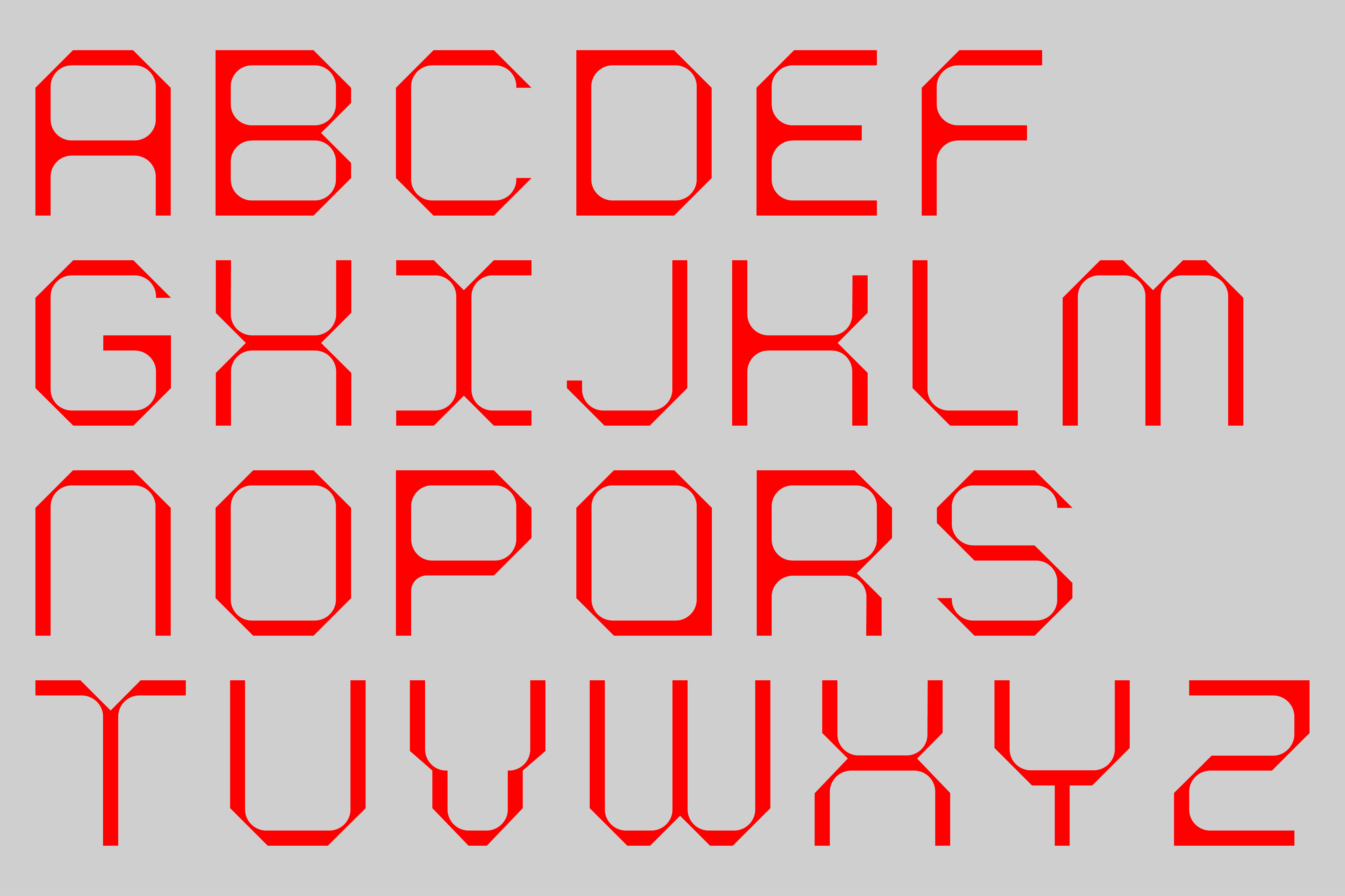
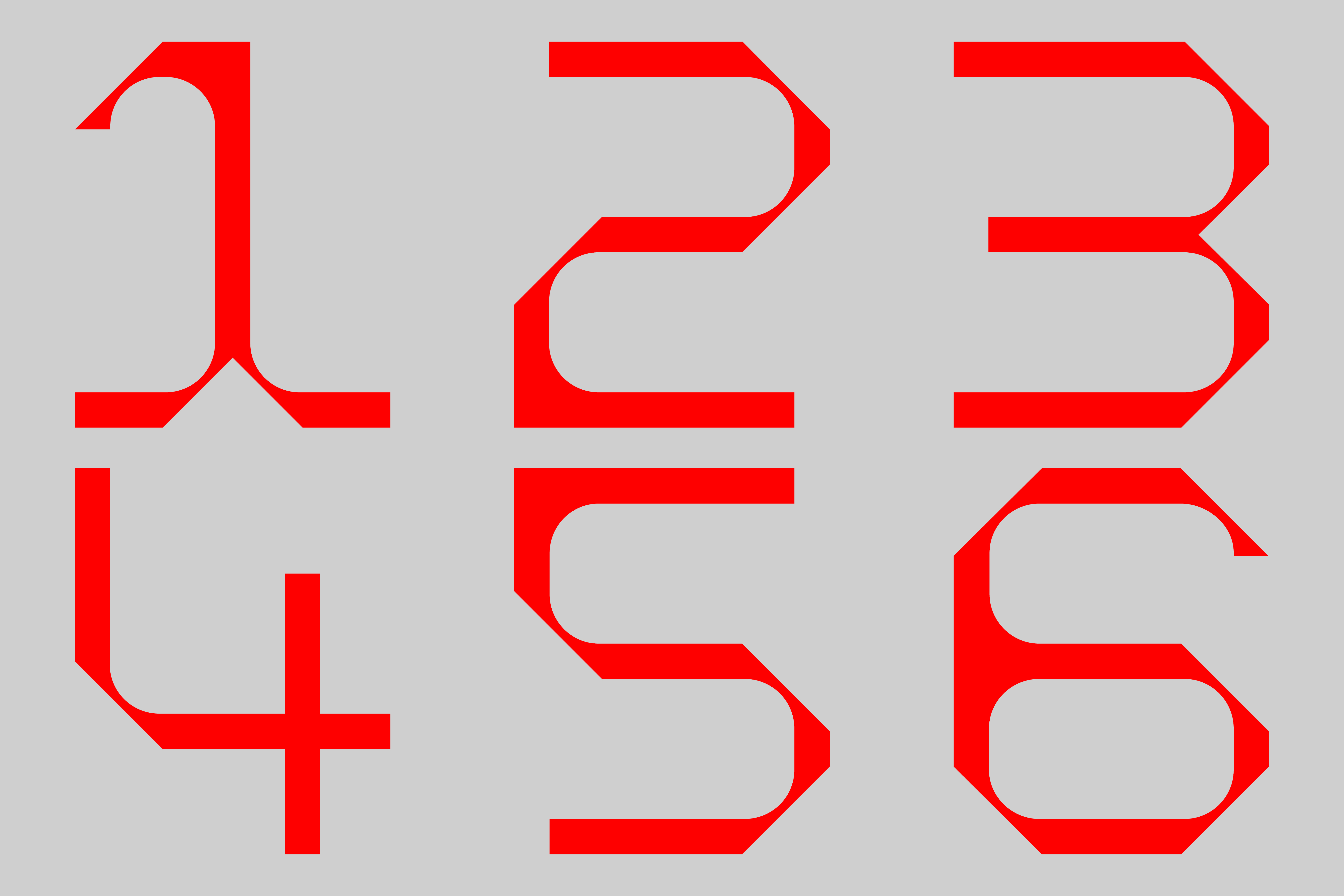
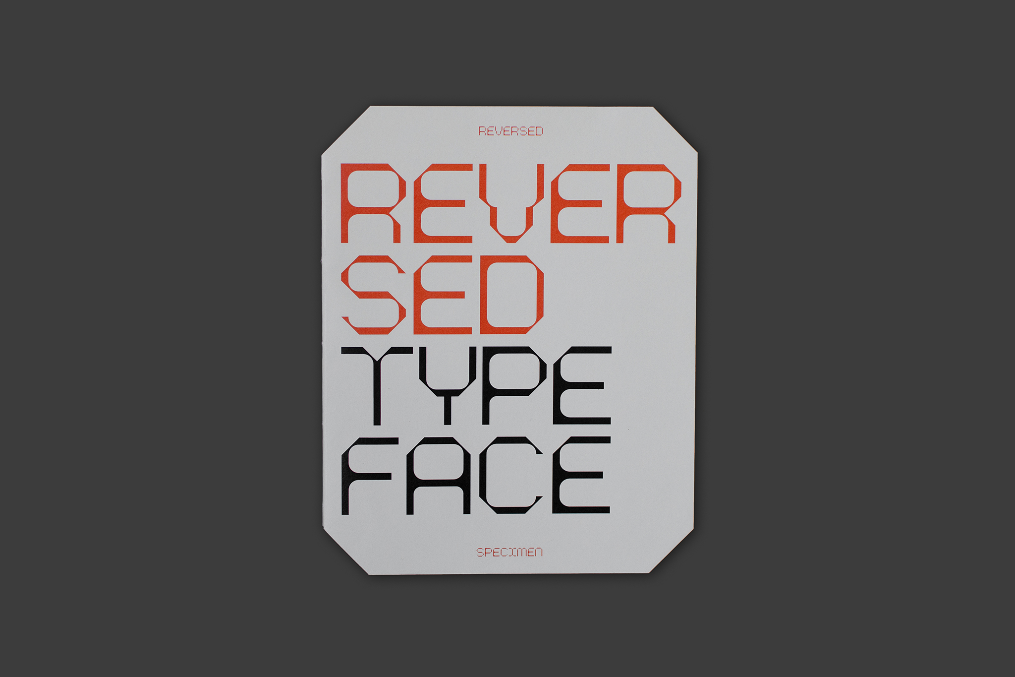
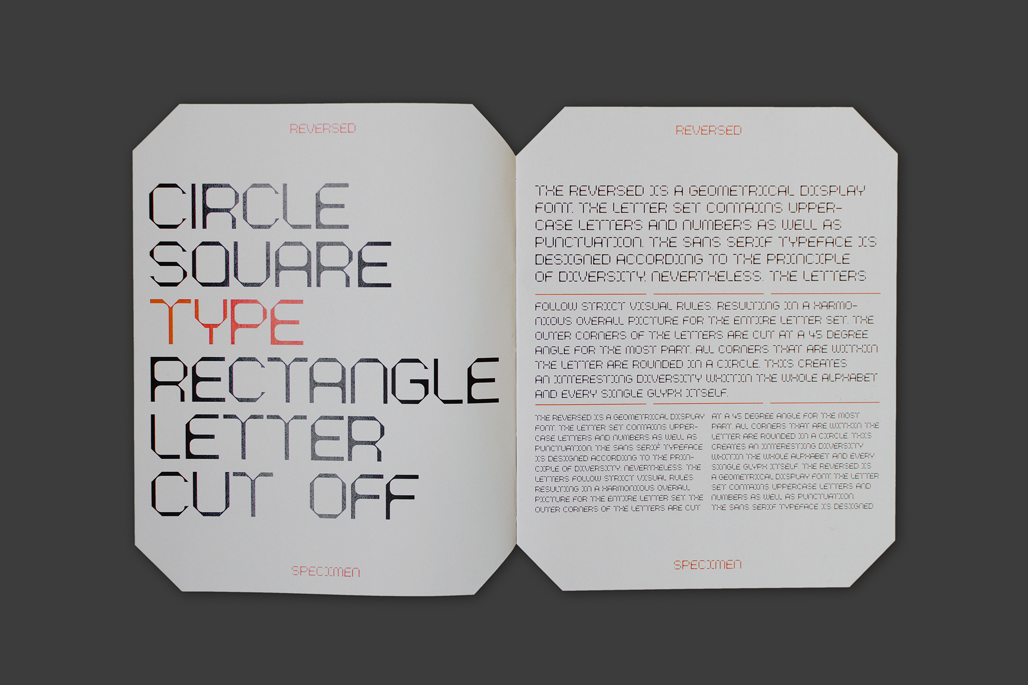
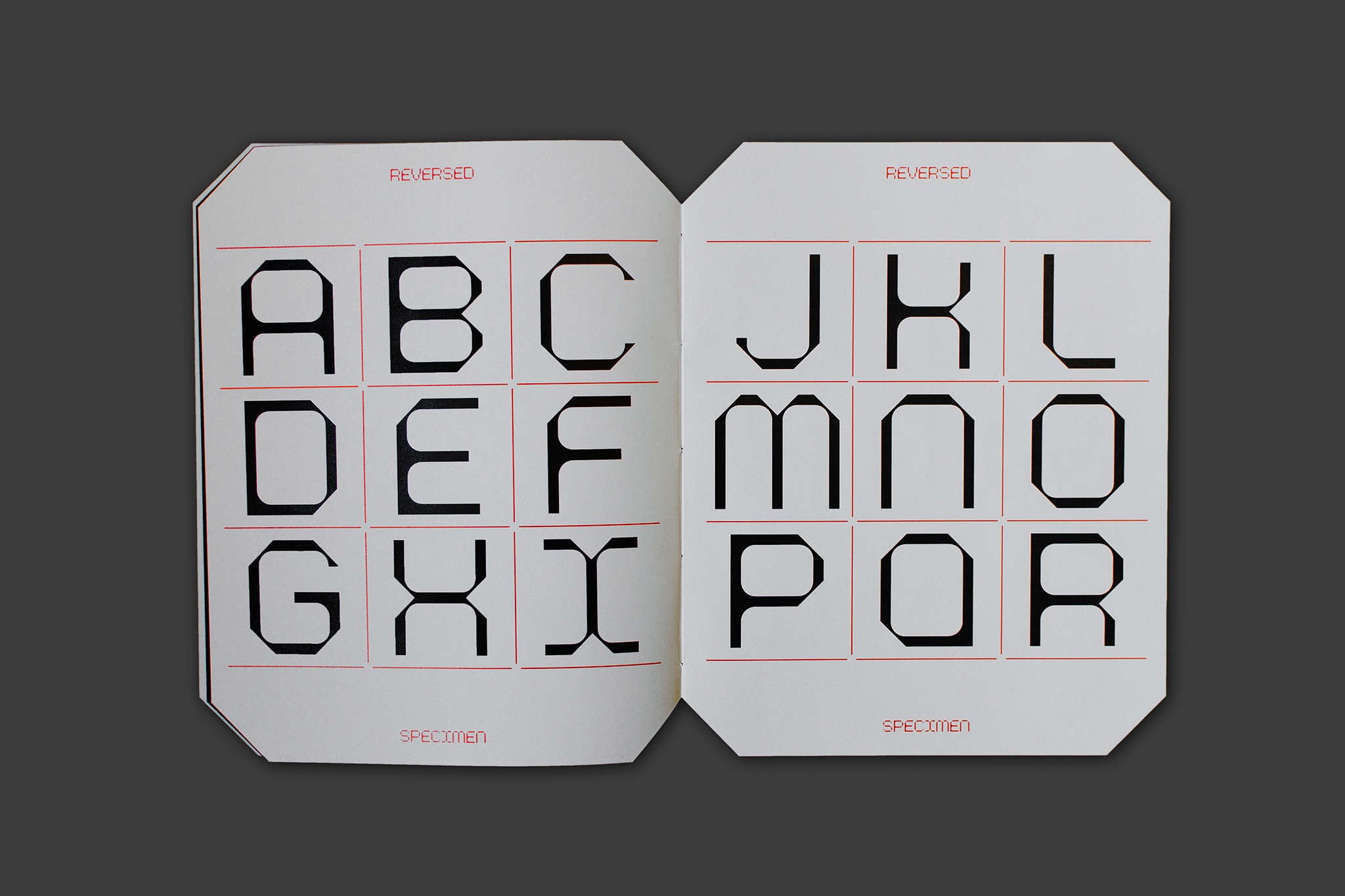
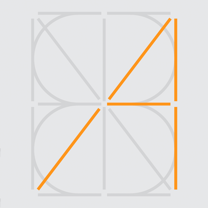
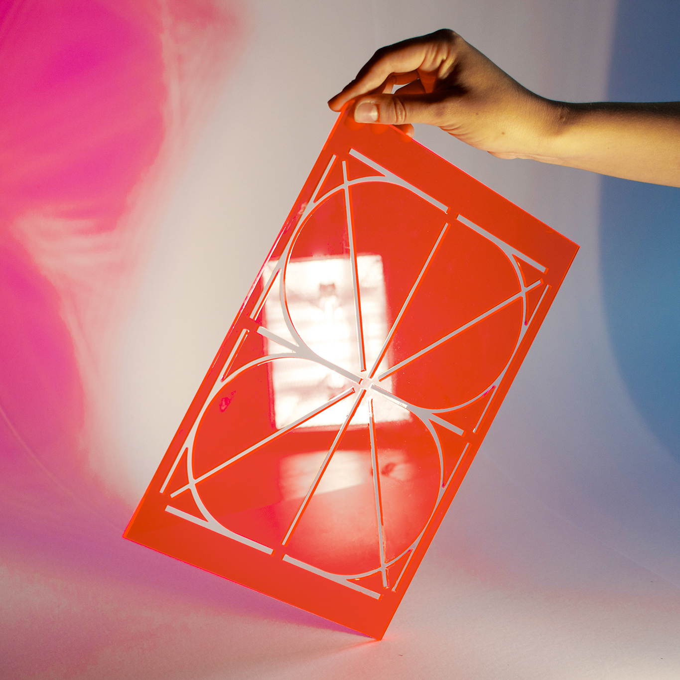
The Reversed is a geometrical Display Font. The letter set contains uppercase letters and numbers as well as punctuation. The sans serif typeface is designed according to the principle of diversity. Nevertheless, the letters follow strict visual rules, resulting in a harmonious overall picture for the entire letter set.
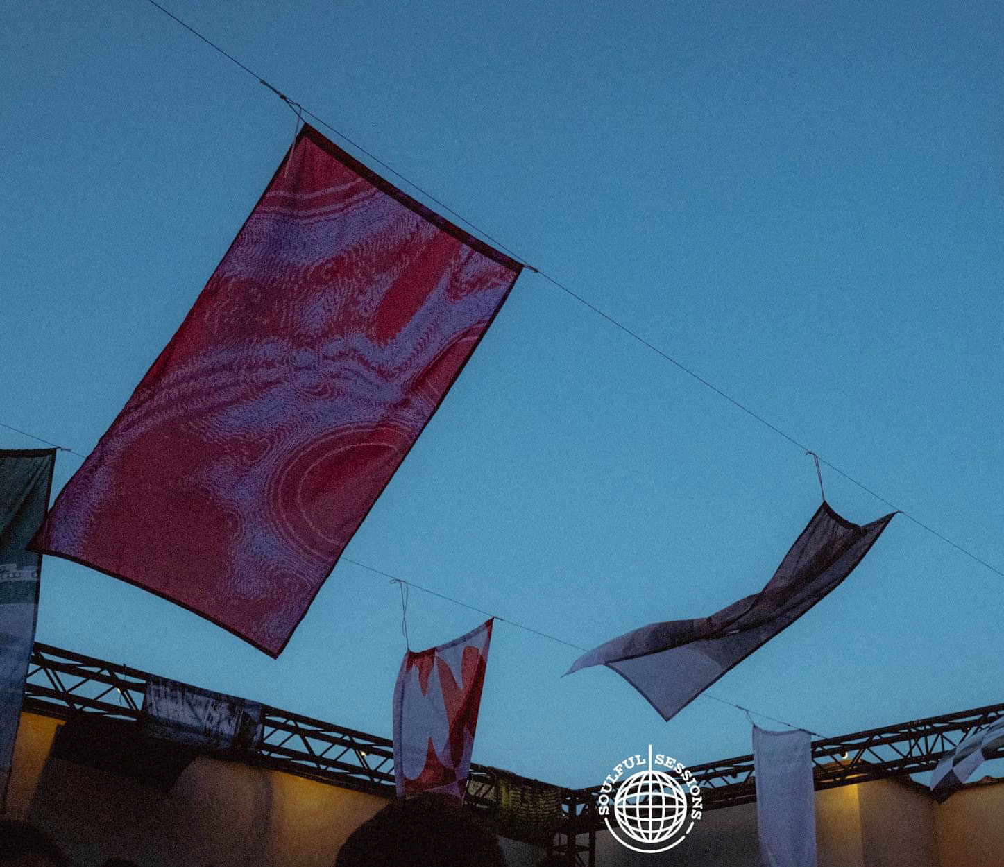
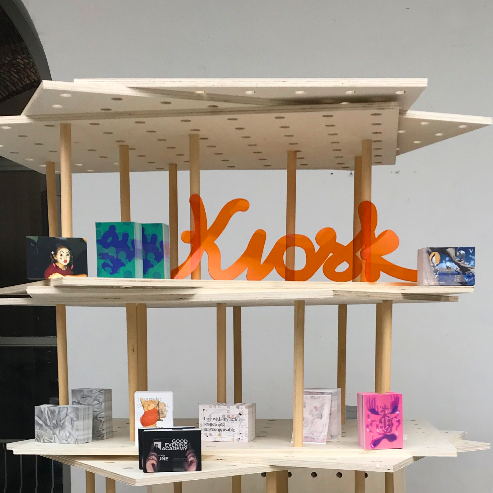
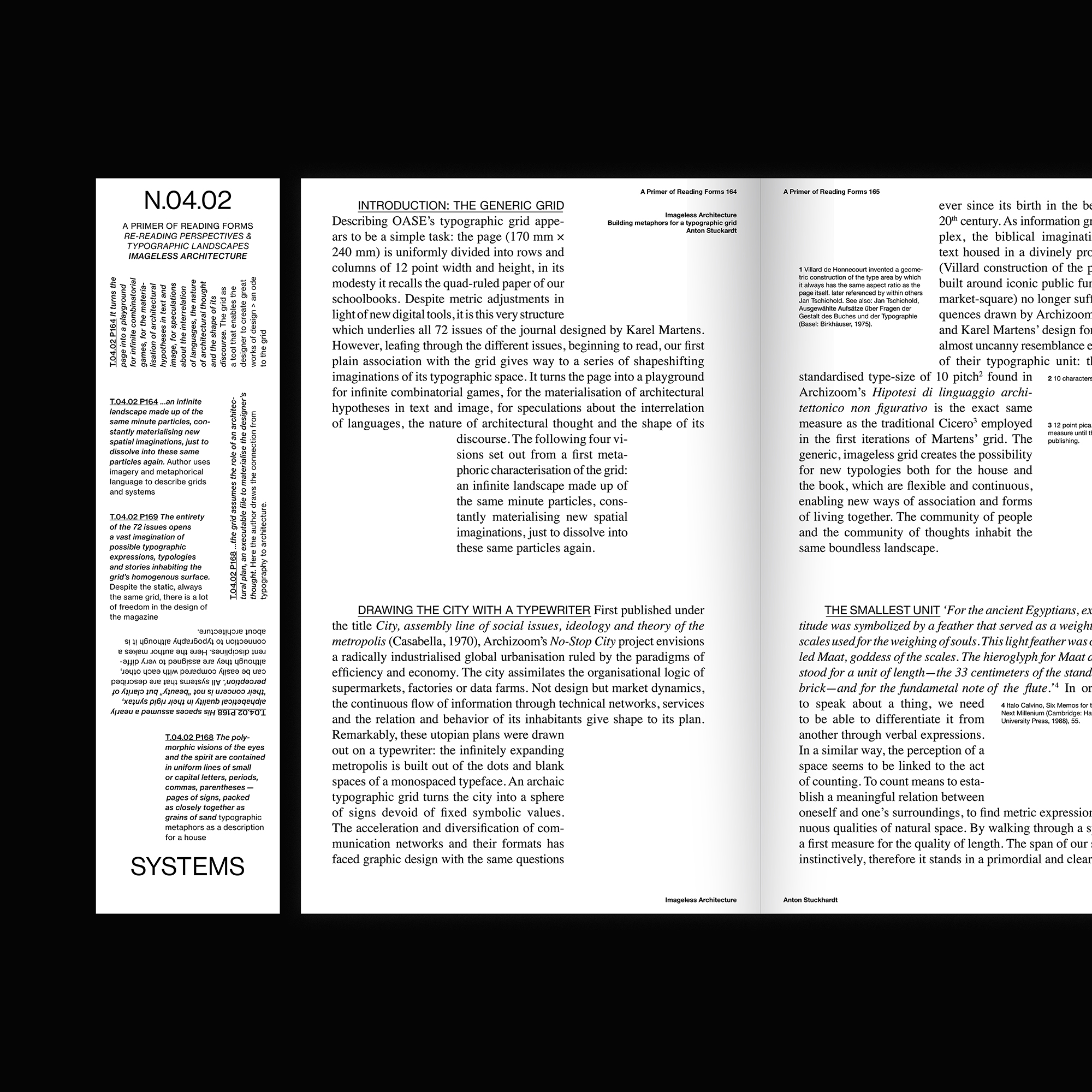
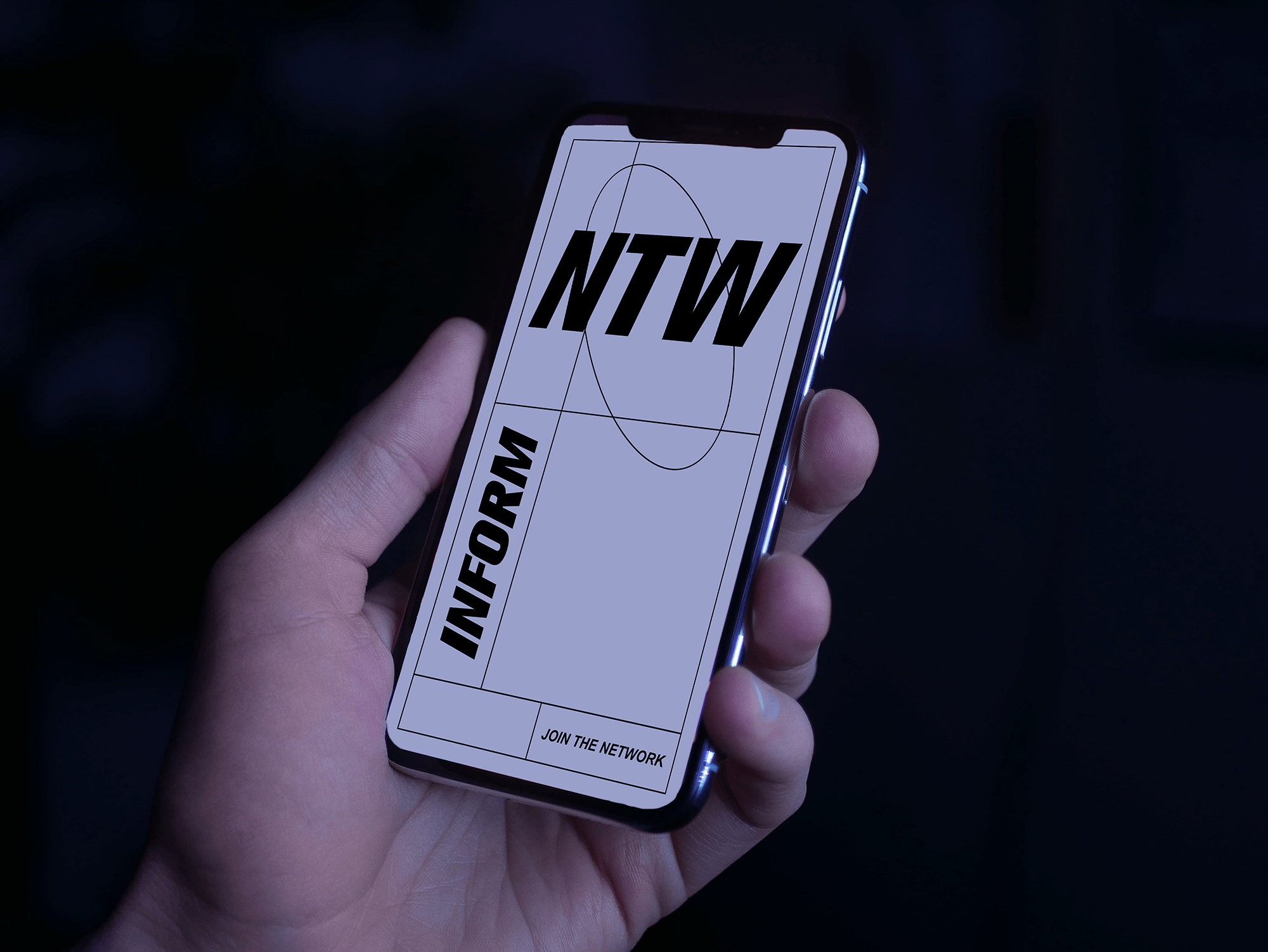
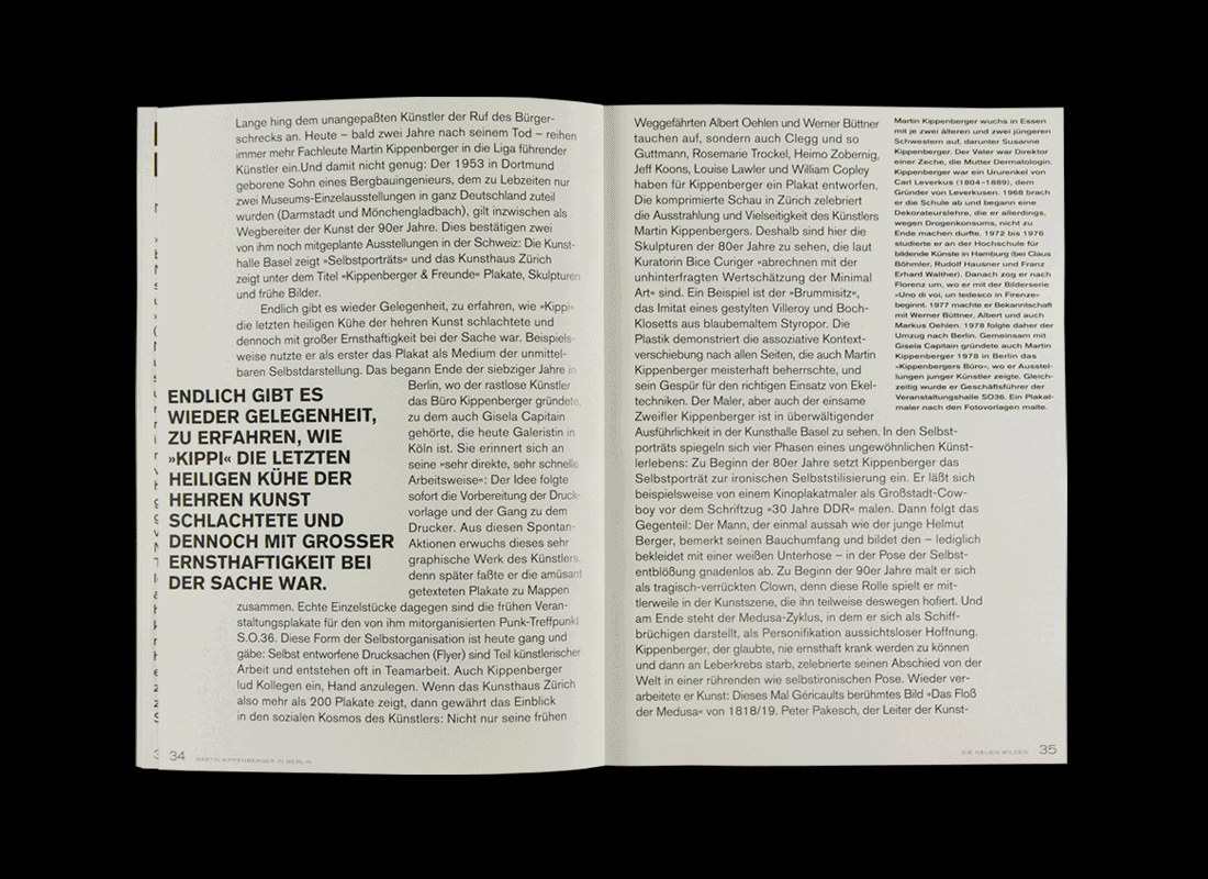
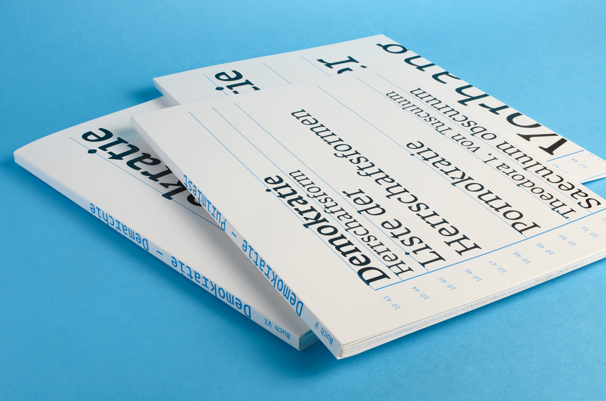
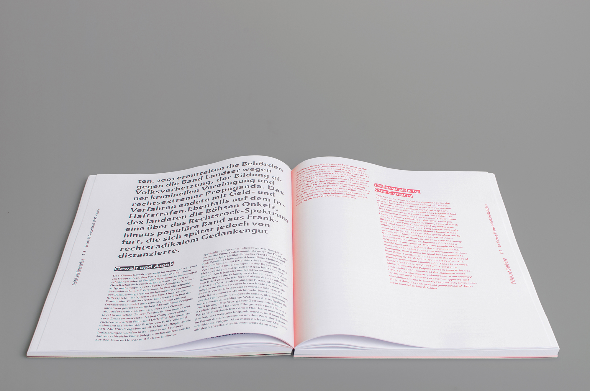
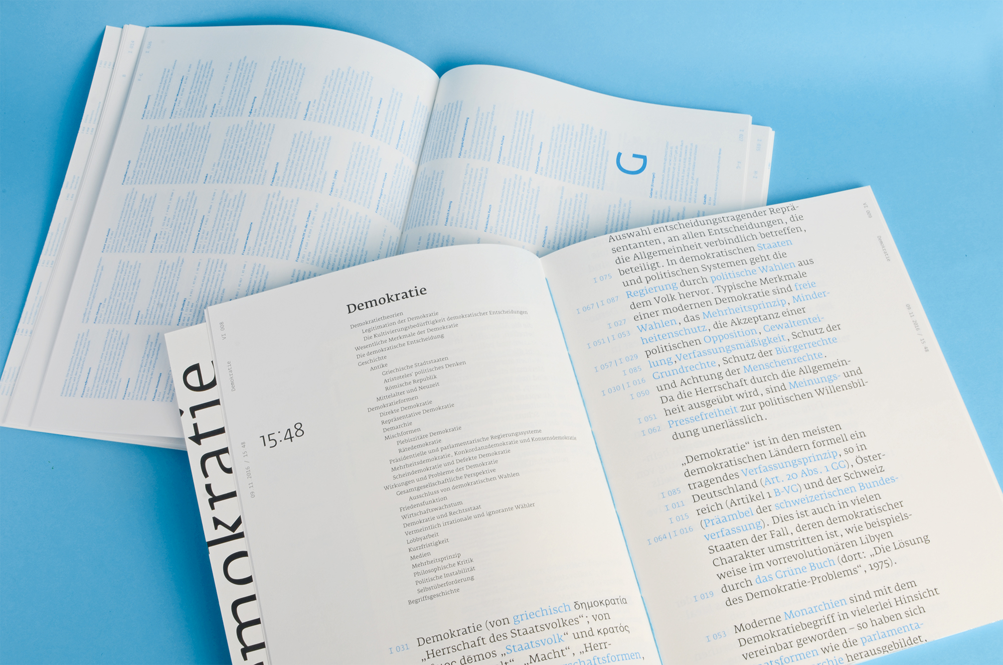
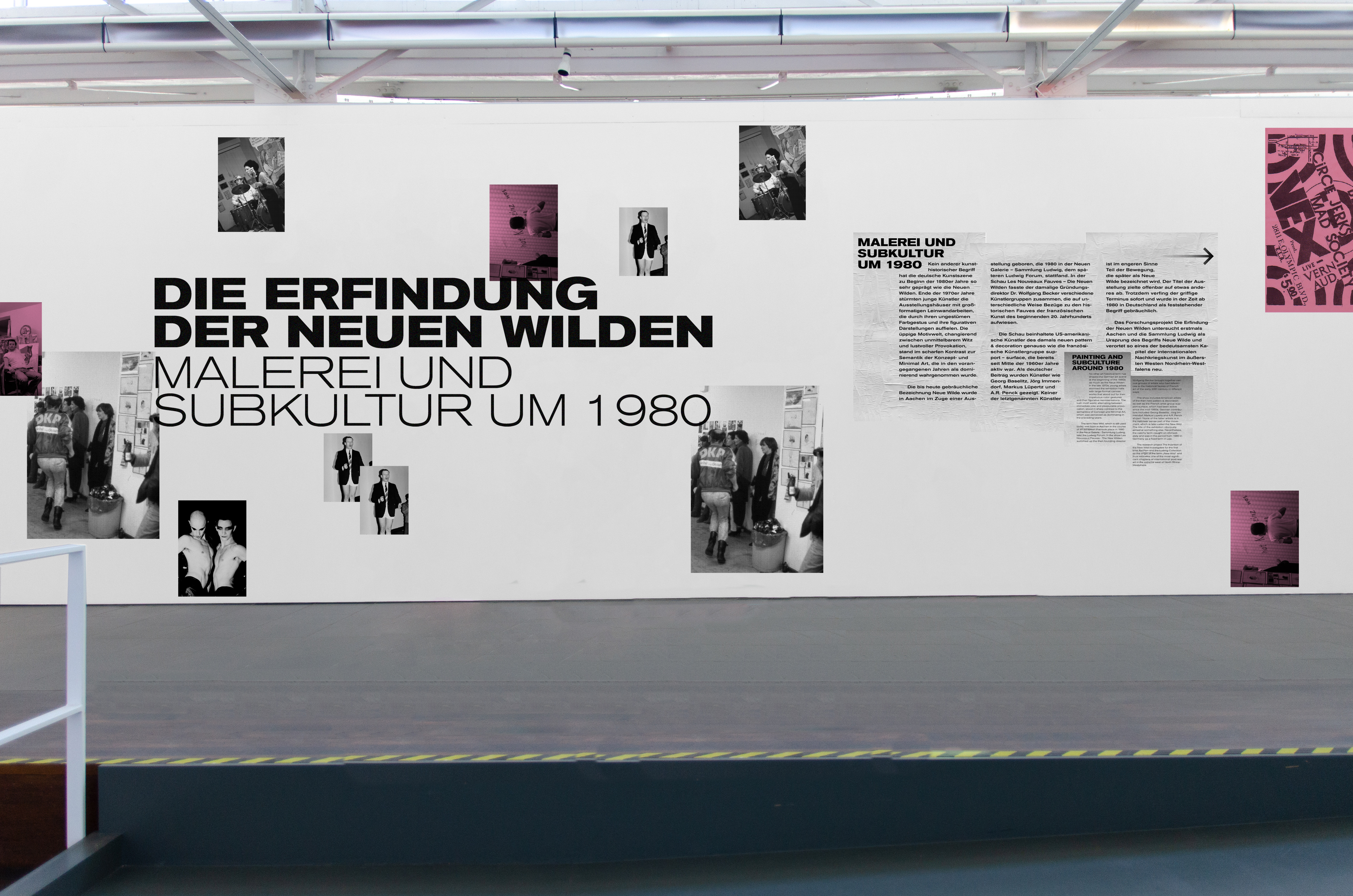
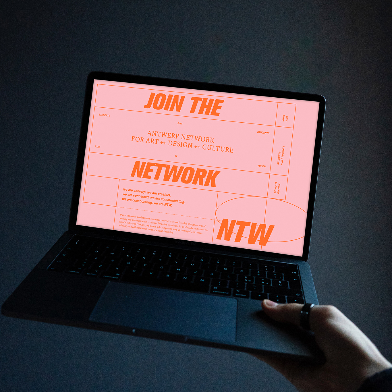
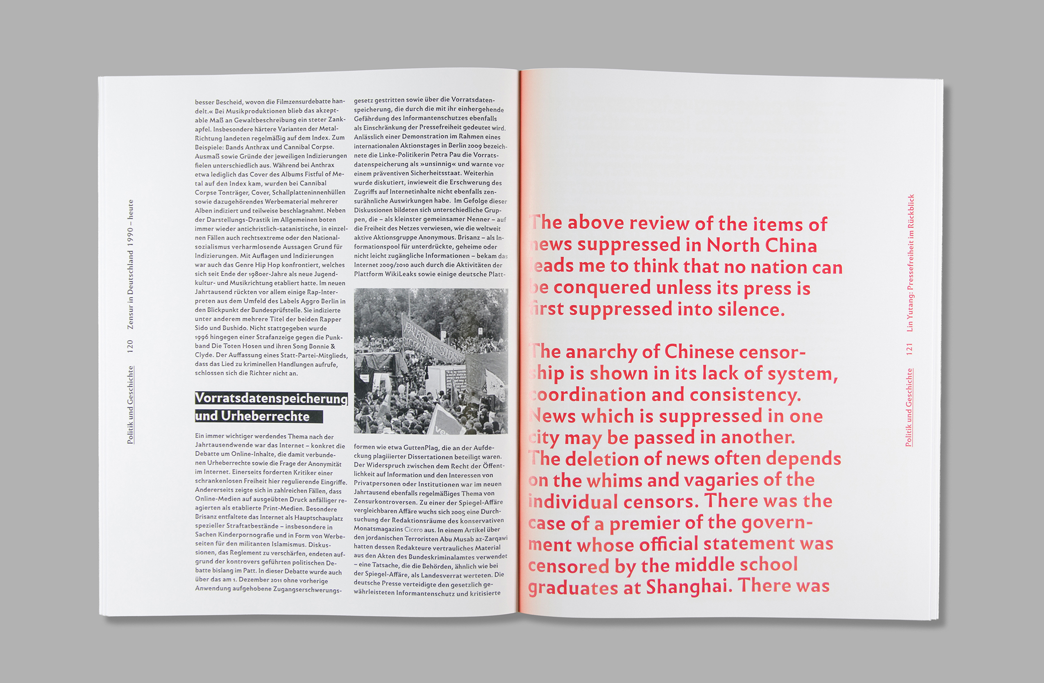
Flag design for Soulful Sessions event in Antwerp (© Studio Böreck)/ Lettering “Kiosk”, laser-cut / “Geschwärzt”, Bookazine on censorship in China and Germany (with Katharina Witt and Lisa Reckeweg) / Publication on the topic of responsibility in design (with Lisa Reckeweg) / Reading as both performance and perception (with Lisa Reckeweg) / Zine for the exhibition “International Affairs” with 44flavours (with students of the Royal Academy of Fine Arts, Antwerp) / ABK Mol Broschure (© Vrints-Kolsteren) / Mascot animation / Contribution for the “Primer of Reading Forms” / Typesketch / Reading as both performance and perception (© Studio Böreck) / NTW – Antwerp Network for Art, Design and Culture, Network for students based on the technology of Google Sheets (with Lisa Reckeweg) / “Die Erfindung der Neuen Wilden” exhibition catalogue (with Sharlyne Schütter and Lisa Reckeweg) / Publication on “Zusammenarbeit” (© Studio Böreck) / Poster design for Circuit (© Vrints-Kolsteren) / “Geschwärzt”, Bookazine on censorship in China and Germany (with Katharina Witt and Lisa Reckeweg) / LetterOne typedesign animation / “From A to Z” individual, printed Wikipedia (with Anna Müller) / “From A to Z” individual, printed Wikipedia (with Anna Müller) / LetterOne lasercut stencil / “Primer of Reading Forms” book design (© Studio Böreck) / “Die Erfindung der Neuen Wilden” exhibition design (with Sharlyne Schütter and Lisa Reckeweg) / NTW – Antwerp Network for Art, Design and Culture, Network for students based on the technology of Google Sheets (© Studio Böreck)“Geschwärzt”, Bookazine on censorship in China and Germany (with Katharina Witt and Lisa Reckeweg) /